
It’s time for some more good news: We want to redesign our current game interface!
As you all know, the interface has been around for quite a while and it had to grow to our needs due to recent additions. Unfortunately, we are not 100% happy with its style, the arrangement of interface elements, and its overall functionalities. The time has come to say goodbye to our old interface and rebuild it:
Rest assured that we are not performing this change just because we can, but because of several arguments:
- Arranging all elements in an intuitive and logical fashion.
- We also wanted to make sure that our minimum screen-resolution of 1024×768 pixels works perfectly fine (and as a side effect, even smaller resolutions profit from the change as well).
- A more modern look! If you remember our latest additions, i.e. the island quests, you will see a really nice and vivid design. We wanted the new interface to keep up with our state of art.
So, within several meetings with our interface designer and user experience expert Stephan, we discussed each single element of our interface and thought about the most logical position for it. We also determined the importance and relevance of each feature to decide whether it should be prominent or not.
In the end, we came up with this ugly mockup (keep in mind: this was just created for internal communication):
As you can see, the interface had to undergo the following changes:
- The minimap has changed its shape and future global features like heroes (“H”) and trade relations (“TR”) would evolve around the minimap.
- The towns are now the most central aspect of the interface.
- Gold has been added as a resource, so you always know about your current amount of gold.
- Settings, sound, and logout buttons have been moved to the top right to be more in line with other pieces of software/games.
- All kinds of quests have been wrapped (tutorial and island quests) on the left. Note that quests can be hidden, just like the menu bar.
- The gold button has been made smaller and also moved away. This allows the menu bar to have any number of elements without becoming asymmetrical.
- Notifications have one bigger button that will show more notifications as soon as you move your mouse over it.
As we all agreed on this course of changes, we (the graphic artists, Malte Mizera and myself), started our visual take on the idea:

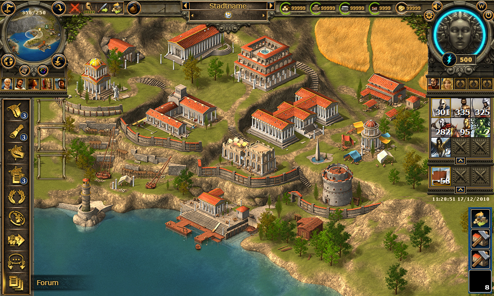
As we also had some ideas and proposals while creating an interface design, even more things have changed:
- The menu bar is now back on the left-hand side.
- The heroes get their own space right above the units. You can have up to 5 heroes within a game world, and thus, you can see up to 5 faces in there.
- The button for using spells is now really looking like a button.
- You can access your town by clicking the large town image at the top left. While in town, you can go back to the map by clicking the minimap.
- The strategic map can still be accessed by the globe-button below the minimap.
Please mind that this is not the final design. One of the goals of this blogpost is to get your opinions on the topic before we start implementing the change: Are you missing anything? Do you have any concerns? We are looking forward to your comments!
The new interface’s very nice. It looks fantastic.
Have we got the second april? :D¨
Gratulation to David Roterberg; you work good 😉
PLEASE stop upgrading things. It’s NOT broke, don’t “fix it.” I like the game for what it is…you people keep changing things and it doesn’t make the game fun anymore.
Hey guys,
i really don’t like the new interface very much.
i like, that the menu bar is on the left again, well done! 🙂
but why do we have such an ugly and big area for the god?
the other buttons for logout, wiki and co. seem to be very missplaced there.
the button to switch between city overview and the map could be smaller – why is it so big?
where is the possibility to insert coordinates? in the field of city overview/minimap? that should be displayed much more clearly.
i really like the idea of the full screen city overview, it brings back v1 a little bit. will we still have windows for the buildings? i liked that really much.
i considered if it was possible to make the full screen city overview optionally. many players liked the window system of v2 more than the system in v1, because you only had one aspect in which you could do everything.
and where is the quick bar? the administrator seems to be active, but i can’t find it.
will it be possible to have the building windows in the “map-aspect” via the quick bar?
that should be enough for now, maybe i’ll comment again if sth. else crosses my mind 🙂
Regards,
Serleter
Some minor things like coordinates might be missing. It’s also possible that you can only see those options while putting your mouse over the minimap.
“will we still have windows for the buildings? i liked that really much.”
– Sure.
“and where is the quick bar? the administrator seems to be active, but i can’t find it.”
– There is an alternative interface design with the administrator enabled. From there, you can instantly access the senate, cave etc.
first of all: thanks for your answers, nice to have those information 🙂
but you avoided several points I brought up.
it would be very nice if I could get an answer to them, too, thanks 🙂
“but why do we have such an ugly and big area for the god?”
– Gods are an important aspect of the game, that’s why! 😉
“the button to switch between city overview and the map could be smaller – why is it so big?”
– Grepolis is all about cities, which is why we want to focus on that. It should be easy swithing between the world map and the city view.
okay, that sounds seasonable, thanks for you answers.
I still don’t love the new interface…but after thinking about it a while, I like it more than the old one 😉
and maybe in some weeks i like the new one in the final version 😉
but i still don’t like the god-symbol…it looks not grepolis-like somehow.
two little recommendations:
the top bar still has the “old” style, but that doesn’t go with the new style of the other elements, you should chage that.
and i would recommend to create a trasition from menu bar to the bar with the advisers.
but all in all you did a good job.
at first, i didn’t like the new interface at all, but now i like it much better! 🙂
I really want harbour check back.
Good job! I like this very much In what update that will be released?
There is no date set yet. First of all, we would like to gather some more community feedback to enhance our initial redesign. If we are all happy, we can start implementing this.
how do I unstore stored quest
[img]http://devblog.grepolis.com/wp-content/uploads/2013/05/main_menue_redesign7_wip_b.jpg[/img]
I think this one is very nice: D but only one comment about it. maybe favor bar is too bright, you can add new layer and put a dark color on it and reduce its visibility and make it litle darker .
Sorry for grammar mistakes
Best Regards
Confict
bb code don’t work 😀 http://devblog.grepolis.com/wp-content/uploads/2013/05/main_menue_redesign7_wip_b.jpg
Yes, it is. The locations of favor is big… very big…
Very cool! I like it!
You’ve got prediction of when will enter into force this new interface?
Sincerely, Michel Lopes
One thing I find I have to do fairly frequently when viewing the Minimap is to change the zoom level of my browser (Google Chrome), so that I can increase how much of an ocean I can see.
It would be great if the minimap had a zoom function built in, so that we could see anything from just a few islands to an entire ocean.
Another great feature would a conditional mapping function to highlight just specified alliances, or specified players, with and without ghost towns.
It’s nice, BUT why you always change Grepolis?
Players of .cz Grepolis will have same opinion on new design as a new bar… =(
Sorry, english isn’t my first language =) :-O
Tower library and farol, it’s that possible? about the interface i like but if the chat was isolated and in down, conected always to everione from the ali who is online give a big help to talk to everyone and make a big vantage to comunication in the game (sorry bad english, i’m From Portugal and a lover at grepolis)
Hi
The new interface… well, it looks good on pictures, but, i haven’t used it yet so, all i say here now is not a god evalution… let me have it!!!! 😀 After trying, then i’ll say something about it, user side. 🙂
Sorry guys, I dislike this one. It wouldn’t feel the same.
Yes, I like this new interface plans, but…
Imho, the first one is the most comprehensive and clearest arrangement, you can not confuse thinks on it. May the others have finest visuality, but at this stage functionality is more important, I think.
– The main, the city name scroll in centre with forward/backward arrows is the bigest hit. Only a little completion for it. Now we must click two times, two else place, if don’t want the active city in center. Would be nice, if could save also the city activation with map positioning, or save map positioning in city name scroll.
– Gold is really a premium, so its best place near by premium functions, on the left.
– Settings, sound, logout. May be better on top right, but *around* the god – this is a miscomprehension. Not the part of the gameplay, they are circumstances.
– Heroes are more logical on right, above units.
– Date/clock under units: uncomfortable. We like fix place for a clock, a fix point in life. Imagine: wait the minute, watch the clock, and units arrive…
– I’m new in Grepo, so I better like menubar at the bottom, but I could get used to it on left. But that arrangement is to crowed for me, and also, the half-symmetry is more annoying than the full asymmetry. And what if a small screen? Should scroll the menubar?
– If the menubar is on left, than notifications can be the second column, because the more and fix sized room. Quests could be on the bottom edge or bottom right, doesn’t meter (because they’re few vs. notifications).
– And one more time on the menubar. The icons should be grouped by function. I.e. chat should be grouped with alliance forum and messages. So a possible order is: (0. ranking) 1. city overview 2. reports (2a. trade relations) 3. messages 4. chat 5. alliance forum (5a. ranking) 6. alliance 7. user profile 8/9. settings/premium. (The followings are pointing out from interface, out from the game:) 10. invitation 11. “big” forum 12. help/wiki.
I like the design for image 3, But couple of quick questions,
Firstly, what world is this reffering too, aka, warrior worlds, or Hero worlds ?
I see you mention 5 kinds of Heros, what is this element ? I have never seen Hero units in any world I have played, even Hero world Bellerophon,
so can you explain what these Heros are, is it a new element being introduced ?
secondly the map screen will need to have coordinate input locations to quick jump to targets.
take city name background scroll from Image 1, and add that to image 3 design, so the name of each city stands out better than on a dark surface 😉
This is the design for warrior worlds.
The heroes mentioned are an upcoming feature which will be implemented soon. You can read something about in our roadmap.
AMAZING!!!! i like the new inerfaace! …but i would be so happy if you work in the graphics of the islands 🙂 and also when it’s winter ..the graphics changes!
sorry about my bad english 🙁
I can play this now in a beta?
The new interface has not been implemented yet.
I believe it looks okay, but you are confusing the overview with lighthouse+ library! It seems like an attempt to make things look better than what they are!
It looks great ! I like it !
I think this game is very funny with or without any change. But I miss an app for windows phone, like other developed for android and ios. More people stay connect by others devices. Please dont remove or delete those parts/codes/algorithm related with these device compatibility.
Thanks for your atention.
Best regards
Looking good! Particularly te last one.
Only one question:
With all these big changes coming, does that meen Grepolis 3.0 is no far anymore?
There is no plan for Grepolis 3.0 right now. We just keep improving Grepolis 2.0 🙂
This is great!
I really like the new interface… The menu being on the left is good IMO and i have no issue with how the gods and all that looks. I think it will be much more functional.
Will the island quests simply sit under the other quests on the left hand side?
My only real criticism is that I believe the wiki is a very important thing in the game! Why is it banished to the right when the ‘Profile’ button, one that cannot be clicked that often, is in the main menu on the left?
Other than that, fantastic work as ever guys.
I like this new outlook, but you could improve with one more thing: I think it would be a great idea, if the reports would be grouped, egg. if I send troops from 10 different cities, and my support get attacked, I would only get 1 report (now I get 10).
After logging in sometimes I just get 800 reports. It’s impossible too see all of them
What about removing the Alliance chat box and putting a collapsible chat window that is always up in the bottom. It would basically take the place of where the menu bar is now and collapse like it does now. Its hard to find and get alliances to use this feature because its so…. buggy and annoying. Most people would rather not use skype or other media outlets. Also add two levels of chat. one for hidden forum people. the other for general members.
-Vys
Very good job guys i like it very much. I have a question about the gold thing, you said above:
“Gold has been added as a resource, so you always know about your current amount of gold.”
What is this? Is Gold going to be add in the game. And how we earn gold what is going to be with it?
Gold is our current premium currency. It will probably be displayed like other resources at the top right of the screen in the future.
Very Good! 😀
It looks nice. I like that it´s all in the side and top edges leaving the bottom clear to see the city.
The “let´s see what is hidden in that pile of notifications after 200 atacks” button is a very useful addition.
I’d like to see you comment on that earlier question about the Library, Lighthouse and Tower all being in the picture. Is it a new feature of the game?
Well, obviously were better the 1.0 interface.
Anyway, Is most comfortable having the bar at the left than in the bottom of the window 😀
nice change!
Love the new interface,
though how would one switch from the city to the map?
This is great!
I really like the new interface… The menu being on the left is good IMO and i have no issue with how the gods and all that looks. I think it will be much more functional.
Will the island quests simply sit under the other quests on the left hand side?
My only real criticism is that I believe the wiki is a very important thing in the game! Why is it banished to the right when the ‘Profile’ button, one that cannot be clicked that often, is in the main menu on the left?
Other than that, fantastic work as ever guys.
hahaha why the wiki mod feels bad 😉 😛
but i do agree with totty
The new layout looks really good, i like that the island is the main focus, its as it should be.
The new tasks seem to be taking a lot of space up, most of us would like the screen to be less cluttered.
I am curious as to why Gold id now on the main screen, it isn’t really needed unless you are trying to push it more.
If you are going to upgrade this part of the game can we concentrate on the actual action in the game and not cluttering the screen more.
As for the suggestion of Grepolis 3.0 please don’t. We are just getting used to 2.0 and the amount of new worlds being constantly released.
Many thanks
Mike
Yep, looks good for me, way better then this.
Hello
First of all I welcome your approaches to change the interface. I think that an update is really necessary!
Here are my thoughts on your design:
What I like:
– the town name and switch buttons (almost) centered in the window
– the new design of the minimap
– the wrapping of all quests into one list
What I dont like:
– Showing the amount of gold next to the ressources. I think this is more confusing then helpful and not really useful information for playing the actual game. It takes up space which could be used to center the town name/switch panel properly
– The button for the interface looks a bit out of place and doesnt really fit into the design. I like the current design better. But if you would put it between the notices button and the color assignments button it could look nice, too.
– The menu bar on the left seems too big when you compare it the other elements. Looks a bit chunky and doesnt really fit the design.
– Dont like the display of the server time and coordinates. Should be in a box or something
– I think the quest symbols are way too big. I would like them to be smaller and maybe next to minimap. Using smaller and round icons to represent the quest giver would fit approximately 8 quests next to the minimap. If there are more than 8 quests active you should hide the rest and add a button which would on click expand the list and show the others
– The notices button should
cross out the last part about the notices button 😉
I love the idea of the new interface. 🙂
I am not sure if this is related or not but today when I logged on I noticed that my ingame reports, messages, and building reports that show up on the right side of the screen are stuck way at the bottom of the screen. So I have to scroll all the way down to the bottom of the screen to click on them and then scroll all the way back up to the top to view them this is extremely annoying. I plan to send a bug report concerning this. But also wanted to know what I could do or if this is related to the new interface or not.
Finalllllllllllllllllllllllllllllllllllllllllly.
yessssssssssssssssssssssssssssssssss.
It’s very good.
And the Hd City overview is also pretty well.
How faster it comes how better.
Ave Grepolis 😀
It is very important for me that the menu bar is on the left!
But when is that update going to take place?
I like this new design. Good to see you are using the feed back given by the community and moving the menu bar to the left of the window and making the gold button smaller. The god area could be a little bit smaller but other than that every thing looks great.
When comes this new magnificent interface redisign concept?
Because the interface of now really sucks to death man.
Please this week ?
the last one looks great it was a lot easier when the menu bar was on the left
Jep This new Interface is really nice I LOVE IT 😀
TOP ^^
Attack indicator should be more prominent, as it used to be in the old 1.00 worlds…