So, as you may know, since last year you can also play Grepolis on your mobile phone. And we are really proud of what our team has accomplished so far, but we are also keeping an eye on the future, looking forward to improving the gaming experience of our game on your mobile devices. To do that, we are continuously collecting feedback via your reviews, comments and suggestions, but also conduct usability tests here at InnoGames to find out what is working good for you, what works well or maybe – what works not so good at all. With all the findings in mind, we are going back and forth to the drawing board to make the app more useful for our existing players and, on the other hand, to make it really easy and nice for new players to get into the world of Grepolis.
So, let’s have a look at the improvements that we are working on right now:
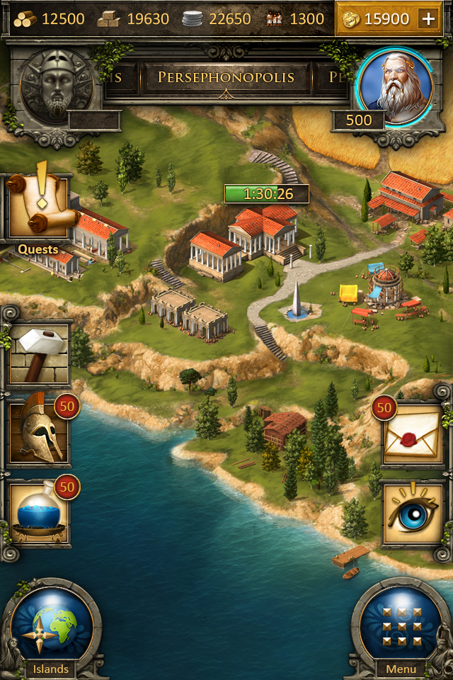
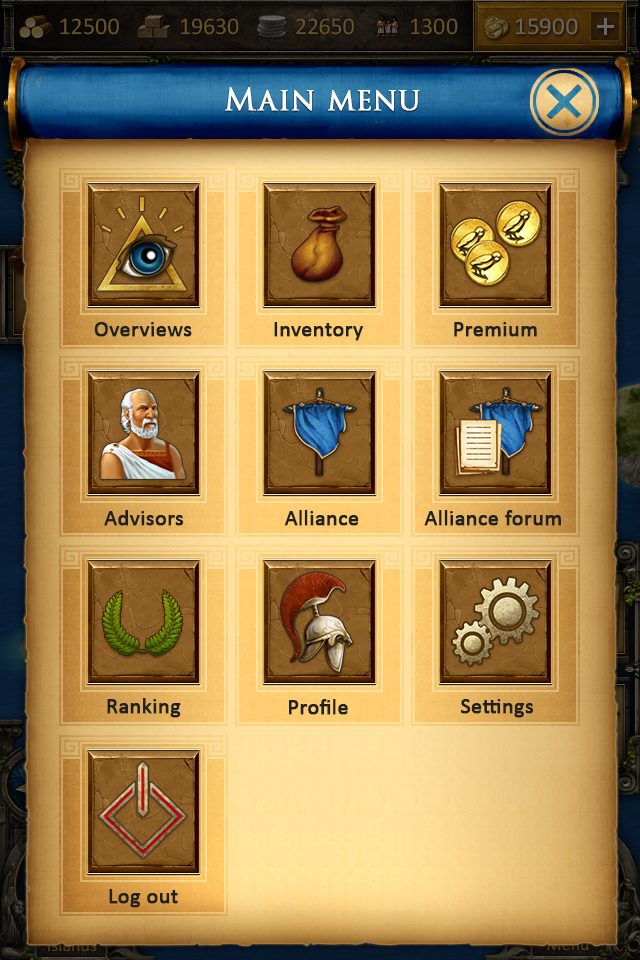
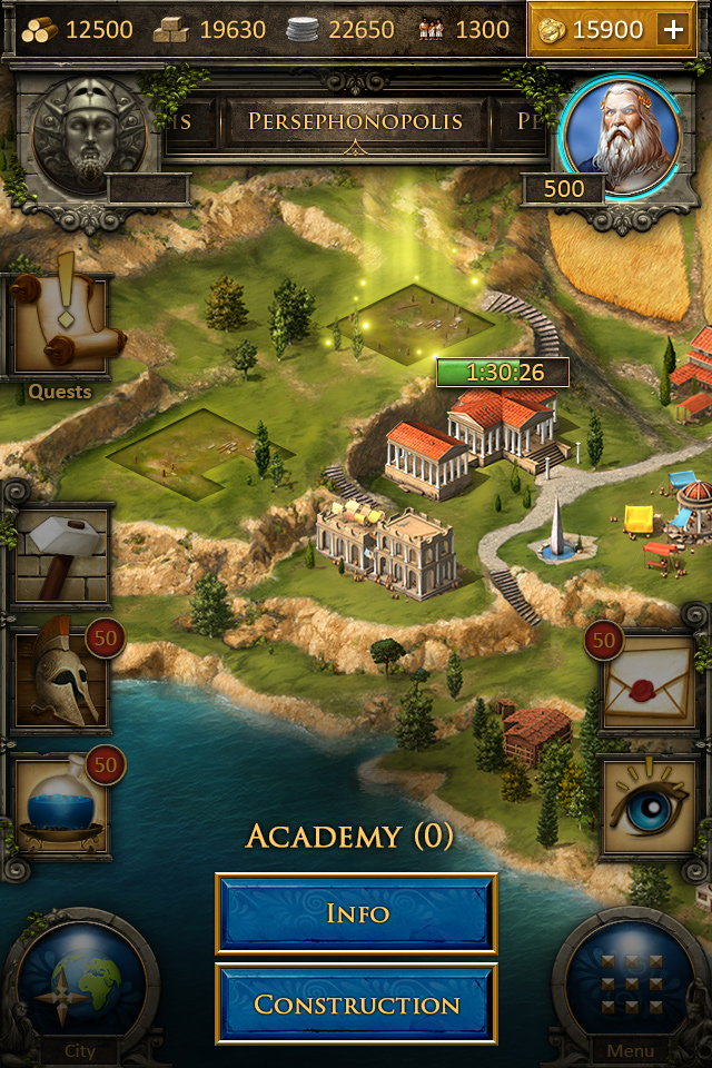
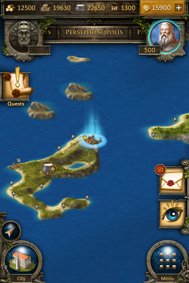
The first big change that you might have noticed are the two big buttons in the lower part of the screen, where the swipeable navigation bar used to be. Why did we change this? Some of you complained about the need to swipe to access several options in the old menu bar while new players had issues to find the option to switch between island/town – the old layout was just not clear enough for them. To address those issues we decided to get rid of the old menu bar and exchanged it with this 2-button solution: 1 button (the left one) to switch between island/town and the other one (on the right) to open the menu with enough screen space to carry all the important items at a glance without the need to swipe. As a nice plus, this layout does not eat up that much space as it’s predecessor did – and leaves more room for the island/town graphics. Without the swiping, you will hopefully save some time to be the greatest ruler in Grepolis!
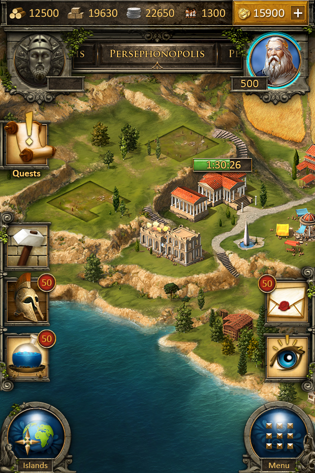
We also decided to work on the town overview (new players where simply overwhelmed by all the informations and options available there, also they issued building orders in the senate and were missing the more common approach to expand towns directly in the town overview by just tapping on the landscape. We are working on that as well; soon, you will be able to construct buildings by tapping on construction sites in your town, making the construction process really easy – without the need to open the senate.
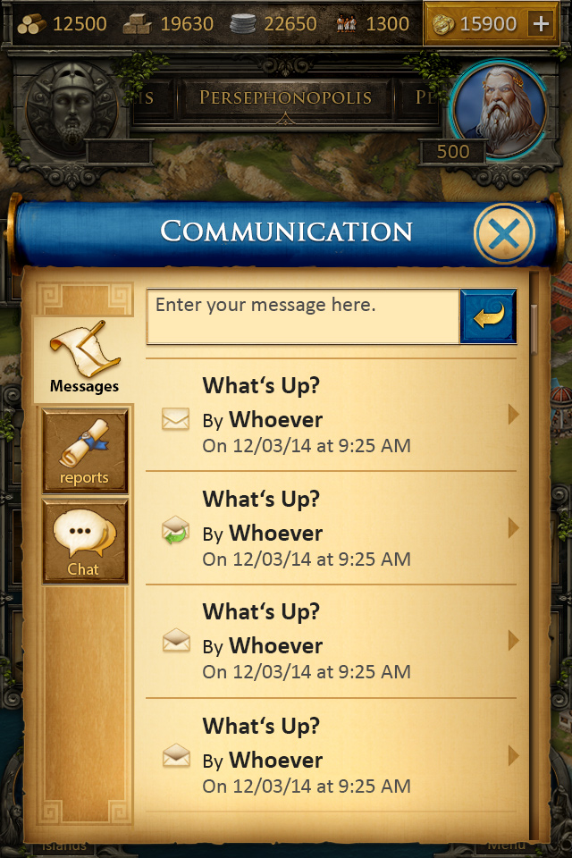
Of course, we will keep the senate as well, so players that are used to work on the buildings that way can still use it. For quick access we added a sidebar where you are able to observe the progress you make in terms of construction, research and recruitment, without the need to enter the related buildings. We are also working on a communication hub, where you will be able to access your inboxes, reports and some other functions that might be created in the near future.
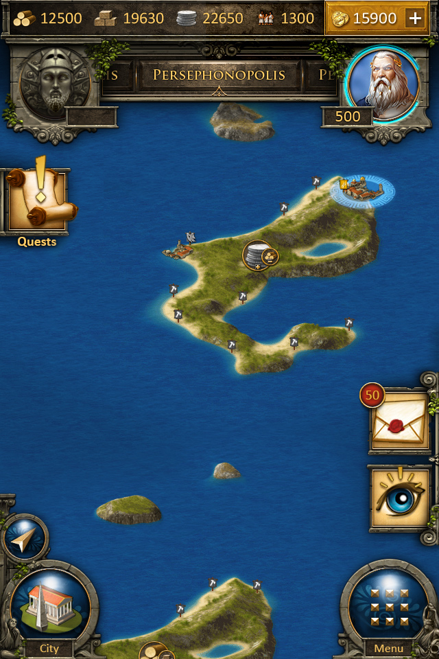
Map: we really want to improve the way of how a player can interact with the map. New players really liked to explore their islands and it’s surroundings but had issues to find their way back to their own town. The button on top of the town overview/island switch will help them to find their way back.
We also added visual feedback to the items on the map to give you more a secure feeling on what exactly you actually tapped and get the most important information without the need to enter the corresponding “info” screen.
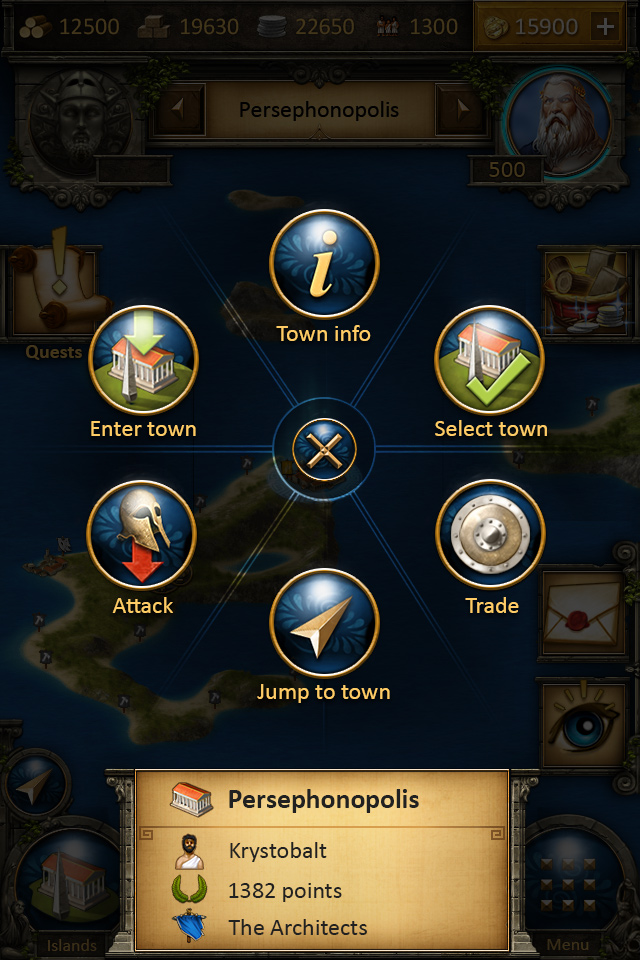
We have worked on the ring menu, making it more convenient to use it on a touch device. Have a look for yourself:
That’s it! We are really happy with the improvements that we have made so far and are really looking forward to see this stuff coming to life. Feel free to comment and give us feedback, you are a crucial part of our work to improve Grepolis on mobile devices!

Dear Grepolis development,
Please do not change the mobile app. I’m very happy to see that you are working on a better Grepolis, but this new design is a complete disaster. That eye, the shining stars, and that light on the building site is like in a cheap Play Store app, these images can be found in any other game. But it is Grepolis. I have been playing Grepolis since 2011, and I’m happy to help InnoGames as a Grepolis moderator, and I would like to ask you to not change the mobile app, its awesome now, and it has the original Grepolis design, thats why a Grepolis player does not compare it with another cheap Play Store apps. Sorry guys, but this design is a complete disaster, please have a new piece of paper, and draw a new design, if you really want to change it.
Thank you.
Kind Regards,
Tamás
yes!
The app does need updating but the most important things are to work out a way to get reports visible on there (even if just a text summary) and to ensure BB codes work from the forum and in messages.
The city info summary is a good idea but I agree most of this looks worse than the existing app
What the mobile app really needs is tablet support. Using the current app on a tablet is just a waste of space and convenience.
This is currently being worked on 🙂
Hello,
Are you planning to launch windows phone app?
This is currently not planned. The technology used behind the Grepolis App isn’t compatible with Windows Phone. This restriction is set by Adobe Air and not by us (InnoGames). There is unfortunately nothing we can do here.
Also, if possible the simulator needs to be added in to the mobile app.
Thanks Mike for your suggestion! We have it on our list for quite some time now and we will work on it as soon as we can! 🙂
it needs to not crash so much, that’s what it needs, it’s unusable on gen 4 ipod touch/iphone other than that I like this tbh.
I’m sorry to hear about the issues you experience with the App! Please make sure your App version is up to date as the latest version might solve the issues you have.
Hy! Great news! 🙂
Please make a better alliance forum. We can`t see the topic titles and it`s hard to scroll down to read all the messages. And I wold like to see the reports too. And a simulator would also be a great thing 😉