Not so long ago, we announce and introduced a new app to Grepolis. Our aim has been to have the same features on your mobile as you have them on your browser.
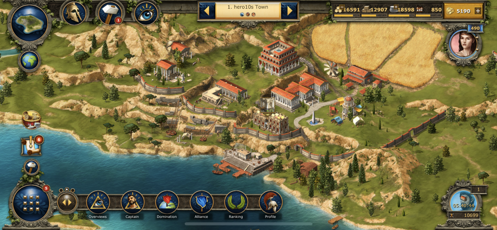
The new app finally brings the full browser version of the game to mobile. But of course, this also brought some problems. A frequent issue was on smaller displays and for people like me with large thumbs struggled a bit with the touch controls. The old app was friendlier to my hands. So, it was not easy for the users of the old app to accept the new one.
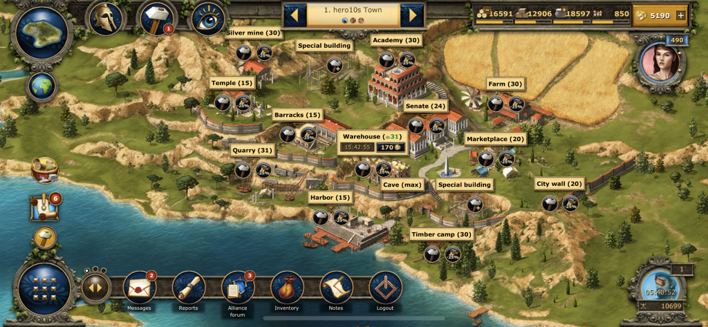
However, we are lucky to have a dedicated and passionate community. You gave us your feedback, the good things and the bad. It was based on this unique feedback that we were able to improve the app, to put focus on the matters that are important to you. We strive to combine the strengths of the browser UI and the old app.
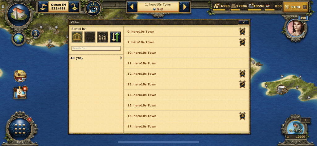
So now the app shows off an innovative new user interface! We believe you will really like this and want to have it as a browser experience too! We got you covered – you can select it in the settings!
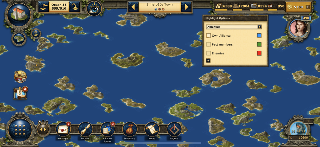
This has been a rework from the ground up, we listen to you saying how hard it was to use on small phones, and that you missed the quick accessibility of frequently used functions.
Here are some features of the new interface:
- With a big map button, you toggle between the frequently used city and the island view. A smaller map button toggles between the 2 map views.
- A new main menu, with which you can quickly access all windows. It has 3 pages. The more frequently used windows you find on the first pages.
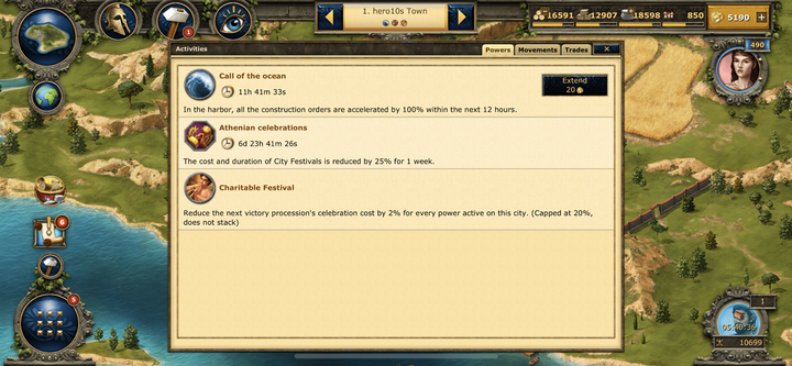
- The activities window shows all thinks happening like in the old app.
- Tapping on the city name opens an improved city list window.
Although not all features of the new UI are already implemented, such as the windows for current construction orders for units and buildings, which are supposed to be opened with the buttons directly next to the map button, are still missing. We have been inspired here by a familiar approach in the old app. We will also get a unit overview like we have in the browser later on.
So here it is a whole new Grepolis experience!
We will be looking forward to your honest feedback!

Very well done! Finally something new, even if it’s not a game feature it’s nice to see there is still passion from the developer team!
But there is just the scripting part that the computer still have and it’s missing on the phone 😉
Thank you for words! It does bring us joy to see our passion is also viewed by our players!
As for your suggestion we will look into this!
hey, I can’t fail to notice that the the new iteration of the hybrid app broke the ability to select a city group and stay in the group a function that was very useful to just quickly sent out defence while stuck on the app, now you need to go 1 by one through the city list each time selecting the next city.
Also, it is possible to change the UI on the browser to the new apps one, why not also give players the ability to do that the other way round?
Thank you for reporting the issue!
As for the Ui on browser, try this: Settings > Accessibility > Activate enlarged UI
ritorno al passato.
La cosa molto importante per chi gioca a grepolis è la visualizzazione dell’orario per programmare tutti gli ordini di attacco e difesa ma soprattutto la classica ninjata per difendersi da attacchi. Senza la visualizzazione dell’orario la versione mobile e la versione desktop non sono paragonabili.
Mi resta il dubbio di come visualizzare in maniera immediata le truppe presenti nella polis ma sicuramente qualcuno degli sviluppatori avrà pensato a questa cosa e smanettando la troverò (cosa però che doveva essere di facile ed immediata visualizzazione)
Grazie mille per il feedback! Abbiamo in programma di migliorare continuamente l’app e ci occuperemo anche di questo!
Do you guys even play the game? the new app is horrible
Thank you for the feedback! and we are really sorry the app is not meeting your expectations, we would appreciate if you could tell us more about what is not to your liking so we can look into ways of improving everyones experience!
I’m proving today the new Mobile User Interface. In my opinion, the app is easier to use and manages to give all the necessary information. It’s very different from the previous one and will take some time to adjust to, but I find it more comfortable
Thank you so much for the feedback! And if you have suggestions to improve the app we would love to hear them!
Much better.
The only thing that is necessary and should return is the permanent column on the right with the units and maybe the bar at the bottom with the constructions.
Nice try, but need some improvement
-Where is the clock ? for a game where timing is essential seems ackward not to find it
-view of orders : when you attack, the view does not update. Clearly not convenient when trying to send 10 attacks at the same second
-temple : if there is no divinity on your city, you cannot send a spell from that city
-troops : you cannot see the troops in the city unless going through agora (loss ot time)
-icons could be set in a different order in the menu (notes or inventory on page one are not essential, but captain or preview is a must).
etc…
The biggest problem with the new app is the lack of a timer.