
We just wanted to give you an update on the final design of our interface revamp. Thanks to your feedback we were able to tweak and optimize the design which we presented in a previous blog entry. We are very pleased with the current draft and see a lot of advantages compared to our current game interface. To recall the goals of the interface revamp:
- Optimizing the interface for our minimum screen resolution of 1024 x 768 px
- Reorganizing elements in a more logical and intuitive manner
- Improved integration of the latest features, i.e. inventory, heroes, quests
- Visually improved design of the interface
Without too much blah-blah, let’s have a look at our final design:
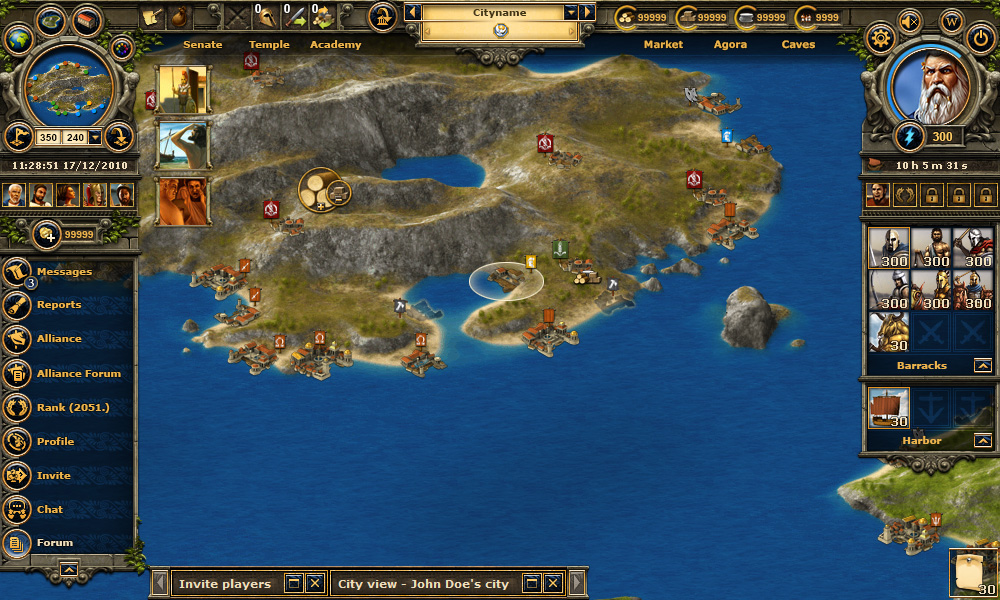
Compared to the last blogpost about the interface, these are the major changes:
- The left-hand main menu changed, so it now contains a caption and is also much more in line with the visual style of the remaining interface.
- Notifications will be less annoying as you will have one larger notification icon. Only the latest notifications will be shown next to it for several seconds. Clicking the notification icon will bring up a brand new notification window, which displays a detailed list about all notifications, including a time stamp for when that notification had been received.
- Buttons around the minimap have been reordered and changed in functionality to allow for a more intuitive usage.
- Since the game works in three layers as soon as we have the full-screen town overview, you will be able to easily switch between these layers with the top-left buttons (town, island, strategic map).
- Gold has moved over to the advisors, as the advisors and gold belong to one another. Also, gold didn’t quite fit to the other resources, as gold is not town specific.
- 7-day login reward will be completely removed, thus you will not see it in this design.
The implementation will start soon. Thanks again for having designed with us the new look of Grepolis. Stay tuned!
Fantastic, I like it really much
need to make tris more important most important weapon the greeks had needs to play a bigger role
Awesome design!
When will this new design come at the Dutch servers?
There is no set date yet for any market.
Looks great! Can’t wait for it to be up and running!
The game is extremely heavy, before the menu on the footer it run smoothly, after that and after each change made, the game takes a lot more time to load, and that can make the difference attacking or defending. Everything evolves, i do agree and support that, but you keep on making the game heavier, it takes more time to load and sometimes it even runs slowly.
Its awesome! I cant wait to see it on my own monitor 😉
Do you have exact, or approximately date for the update?
Thank you,
Tom
Neither an exact date, nor an approximate date, sorry! :/
Simply and good – you nailed it, David.
I really like the design, it’s definetly a continuation of the original GUI coupled with a better user experience.
Like button pressed 2 times 🙂
The menu on the left side is horrible, juste horrible. I liked the other version, I’m not too sure about that one …
like like like:):):):)
No offense, but I wan’t to play Grepolis, not Alien Spaceship Simulator 2013.
I don’t understand your statment, because the visual appearance of this draft isn’t even remotely related to Science Fiction. 😉
Smart answer 😉 And now that I actually played it, it feels nice 🙂
I like it, we can find all in the same screen, it’s like having somo kind of Premium for free 🙂
Its Pops, I really like this design, it looks alot easier to use,everything is right there.this should help alot of people also the ones just starting out.Thank you.
i’m not gonna have 150px :((((
my screen resolution is 1028X600
Great Work, Guys! I love the new UI.
Maybe you yould think about the idea of showing the last 5 notifications in a tooltip when hovering the notifications button.
I really hope that it won’t give any trouble with my laptop because it is already having a hard time while playing Grepolis…. And I still mis the old version(1), never had any problems with it and I know a lot people who feel the same about it. Sometimes less really is more…. Still I must admit that it looks great but for me that is not so important.
I hope there are still some individual changes possible like the Quick Bar or even more customizations.
I like very much it,
about: “7-day login reward will be completely removed, thus you will not see it in this design.”
Don’t we have the “7-day reward, when we start in a word?
thks
The first-7-days login reward will be completely removed from all worlds.
The new interface looks very nice. Good work, David. 😉
17.12.2010? LOL 😀
One more thing…
Can you guys do the new interface in a way the players can move things around to suit them?
E.g:-
Being able to move the forum in the quick bar to a higher level.So then it will be below messages e.t.c….
Is that possible?
It would really help
Looks awesome!!!!
So Inno just added the 7-day reward 1 or 2 months ago, and now you guys take it out! What are you guys doing?
The impact / usage of the feature was too low. If a feature doesn’t add enough to the game, we rather remove it to reduce the complexity of the game. 😉
Looks awesome guys.
Looks great! Now I have to think about where to put the toolbar from my userscript 😉
If I could change one thing though, I would rather see the buttons for the settings/sound/wiki/logout not arranged around the picture of the god but next to each other on the top bar and a little smaller so it fits the design of the top bar. The reason behind that is that you dont need these buttons very often (once settings are made you dont have to change them often, wiki is only interesting for new players, most likely you will not constantly change sound to on/off, logout only needed when u actually want to quit ^^) and with the arrangement around the picture of the god it seems that they have something to do with it. I guess you wanted to go with symmetry but this just doesnt really feel intuitive to me.
Greetings
Quack