Hey there,
this time I would like to provide you a sneak-peek at our upcoming change: The Fullscreen Town Overview. Maybe you would like to know why we are doing this. It’s simple: from time to time, we have to enhance the game in order to provide new players an easier and more appealing start.
Every online game has to rely on a constant flow of new players. With this fact in mind, you can guess it’s vital to convince new players of the awesomeness called Grepolis as early as possible.
We have never been too happy with the town overview being shown as a window. It feels odd and a bit technical.
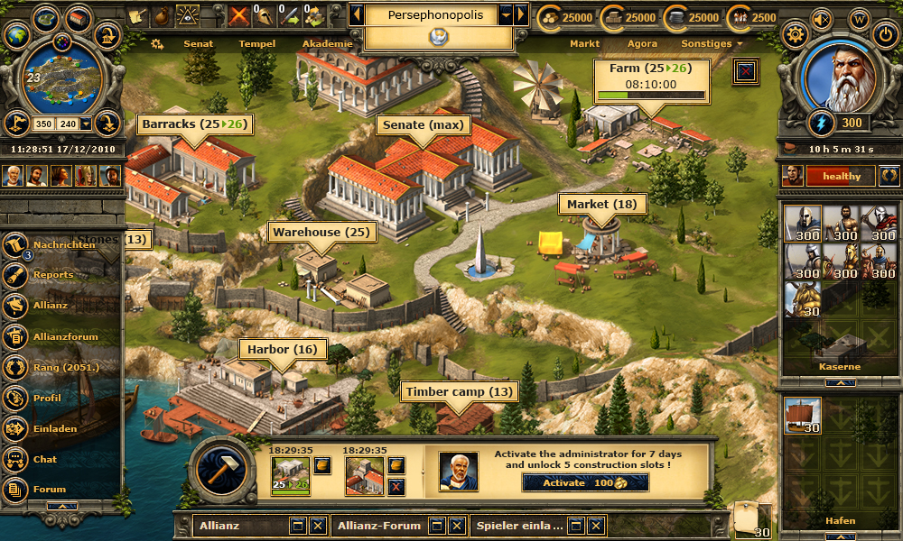
With the fullscreen town overview, players will use their full resolution to display the town – not as a window anymore. You can scroll the view to see some of the town’s beautiful surroundings!
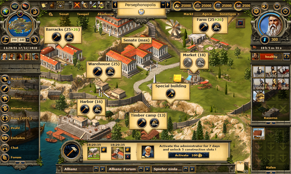
But just this little change was not enough for us. You know, most players issue new building orders in the senate window. Again, this feels incredibly technical, which is totally fine if you aim for efficiency only. However, many players would like to get some rather haptic feedback when expanding their town.
This is why we overhauled the building mode as well. It will now better display your available options and what’s currently going on in general. This is how the town looks like with the building mode being inactive:
And of course, the display changes if you turn the building mode on:
Yeah, this was a short entry, but there is not much to explain about this feature. 😉
Have fun!


It look just like Tribal Wars town overview, except the colors are nicer here. I find the many images on the screen tiring for the eyes, I think I’ll have to change my glasses, so it’s a big NO from me…
When this will arrive on beta.
Probably in March. 🙂
Greetings,
This is just awesome. Thank you for beautiful, new designs.
But are you going to change the period of Premium time? Because on the picture the Administrator costs 100 golds for 7 days, instead of the current 14 days.
Thank you again, and have a nice day.
Uh, sorry. I really didn’t notice this mistake. No, right now we do not plan any advisor changes.
The screen which I used in the DevBlog entry was created by a graphic artist. Graphic artists usually do not care much about the texts, as we Game Designers replace the texts anyway. 😉
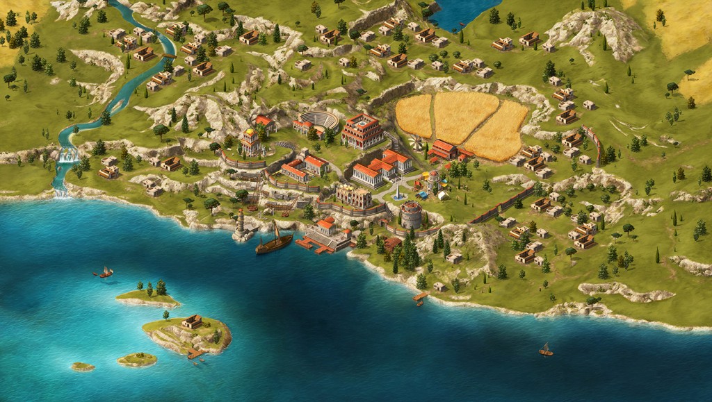
Why is there a light-tower and a theatre at the first picture?
ps. looks good, but there should be more important projects
I think… so… it’s orribles!!
And truly beautiful
Beautifully, but who needs something like that? Absolutely nobody here, gets their it actually still with it me this whole bells and whistles of this Game with intention against the wall drives. Their has enough other building sites on your priority list actually right at the top to stand would have. There brings their rather new things out, which still more error produces.
Being a browser game Grepolis, it should not be as light as possible?
This new feature will make the main screen only heavier, forcing players to maintain an active overview of the city during the launch of the attacks and the media.
I think full screen will be nice, but I would like the build screens to be smaller so I can see the world map behind it or add features such as a timer for demand and looting to the admin screen.
I think that this new update will power up the delay in the attacks.
By that, i think the big problem in grepolis is that delay and will be great if someone try to solve it.
When will be recruited the new members Beta Focus?
For now, there is no date set. Let us first gather experiences on how well the whole project “Beta Focus Group” is helping the community and us as developers. 🙂
beautiful, but no needed, useless, unnecessary and not required.
This new feature will make the main screen only heavier
Nice, very nice. But i have to go with MDGeist74 and iranes300. This looks nice, but i think that this will be to heavey for a browsergame. Is it possible to invent a tatical-mode. Just low graphics, so you can change the mode to do your attackings an change it back to have a nice look?
Sorry for my bad english!
We would gladly add a “strategic map” to the game allowing for better planning and more overview. But this would be a beast of a task, which is why we do not see any reasonable chances in 2014 for a new and improved map.
With the implementation of new UI the functionalities of the mini-map were destroyed completely, while on the other hand it is crucial to offer access to a strategic map for those who will not be able to avoid using the fullscreen town overview (i.e. non-premium players). What is more, the new overview is no overview at all for those playing on smaller displays/resolutions. They will have to scroll around in the fullscreen overview for access to certain buildings, while this was not necessary in the current window solution. And a big and annoying bar is back to the bottom of the screen, after it had taken us almost one year of protest and discussion to get rid of the oversized brown bar of the main menu.
The implementation of the fullscreen town overview should be postponed until a reasonable solution for the map problem is available.
As Pedro said: “useless, unnecessary and not required”
Why is there a light-tower and a theatre at the first picture?
Because it looks nice 🙂 Of course it is not possible to have such a town in the game.
It’s orrible, fix the bugs.. is better!!
You are right. But what should the grafic artist do, during the time, when the developer delete the bugs 😉
How can I subscribe or contact you guys?
It really depends on your enquiry. Feel free to ask questions here (DevBlog). 🙂
Looks nice however I’d also welcome a move in the other direction.
Maybe it’s just me and I am just oldschool, but I think most players would appreciate if you gave them a choice and allowed a “light” and strictly functional overview as well.
When I look at it, it look like Grepolis 1 to me. It was when we didn’t have windows and we could have only one thing opened. Generally, I think it’s a step back.