![]()
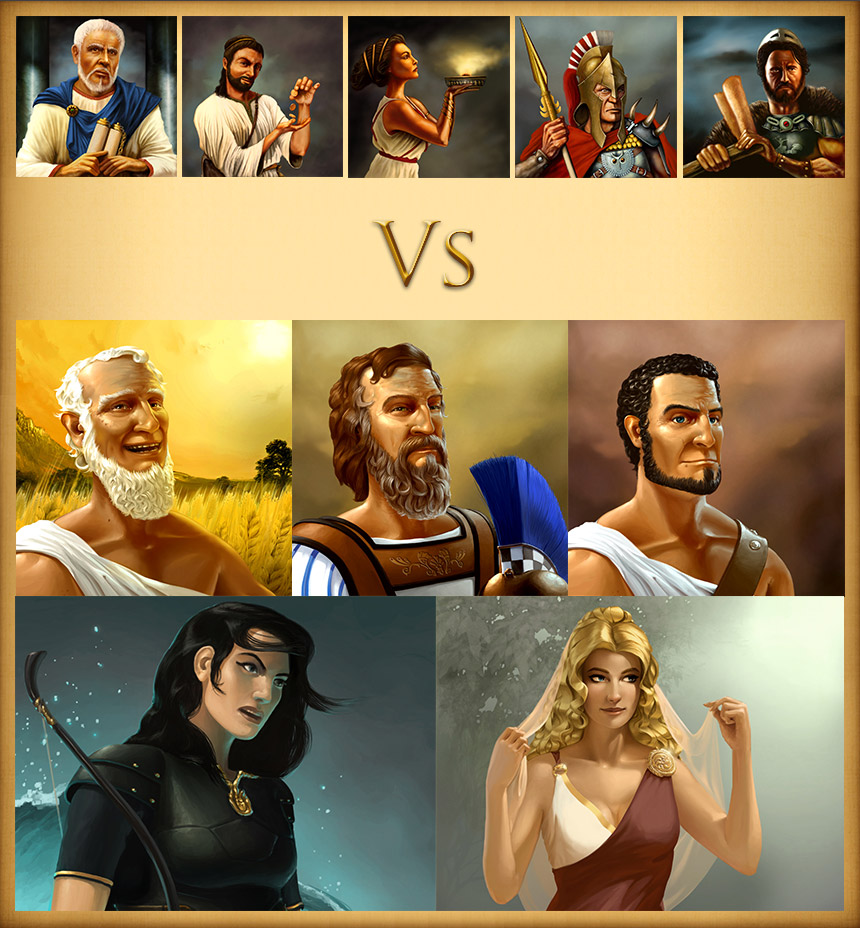
Today, I would like to talk about the advisors. More precisely, on the advisors’ graphics. These characters have been a core feature of Grepolis since the beginning, and they lived through the evolution of the game quite unchanged… until now.
A lot of new characters have been introduced through quests and the heroes’ feature, and over time they appeared to get better and better, more crisp, more subtle coloring, etc. That’s a natural thing, with time a graphical style evolves and improves, reaches maturity. We always took care of keeping the overall style consistent, but over the last months we had a growing feeling that the advisors images, definitely some of the oldest in Grepolis, are simply getting outdated.
I should add that, apart from an artist’s style and skills, technology obviously improves too. 5 years ago we had not considered HD graphics; Grepolis was meant to be a browser game and we had no plans to use graphical files fit for mobile and retina displays for instance… As a consequence, the original files for the advisors’ graphics are also pretty limited in terms of size and definition, and we needed some flexibility for better screen design and multi-platform use.
So, we decided to start working on the new advisors by sculpting 3d models. This has been a new way of working on characters since the Hercules event last summer. It enables us to test things quickly, like poses for the characters, accessories, facial expressions and so on. Once we agreed on the details, the character is exported in high resolution.
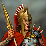
Let’s take the Commander as an example, and explore our design process.
For the update, we decided to change a few things, other than the style. First, we thought this advisor could look more experienced somehow; he’s the man that will help you plan and lead your battles, and his value comes from the many battles he has seen. Let’s make him a bit older, with a noble attitude. We also decided to rework the armor design, which had a barbarian feel to it in the older design.
Here is the 3d model we built:
At this point, most of the work is done. This is the time when we gather feedback within the team and discuss details, before we begin the final step, the overpaint. We open the 3d model in Photoshop, which has been rendered in the right angle, and will now paint and adjust the character according to the feedback we got, to bring it to life in the hand-painted like style of Grepolis.
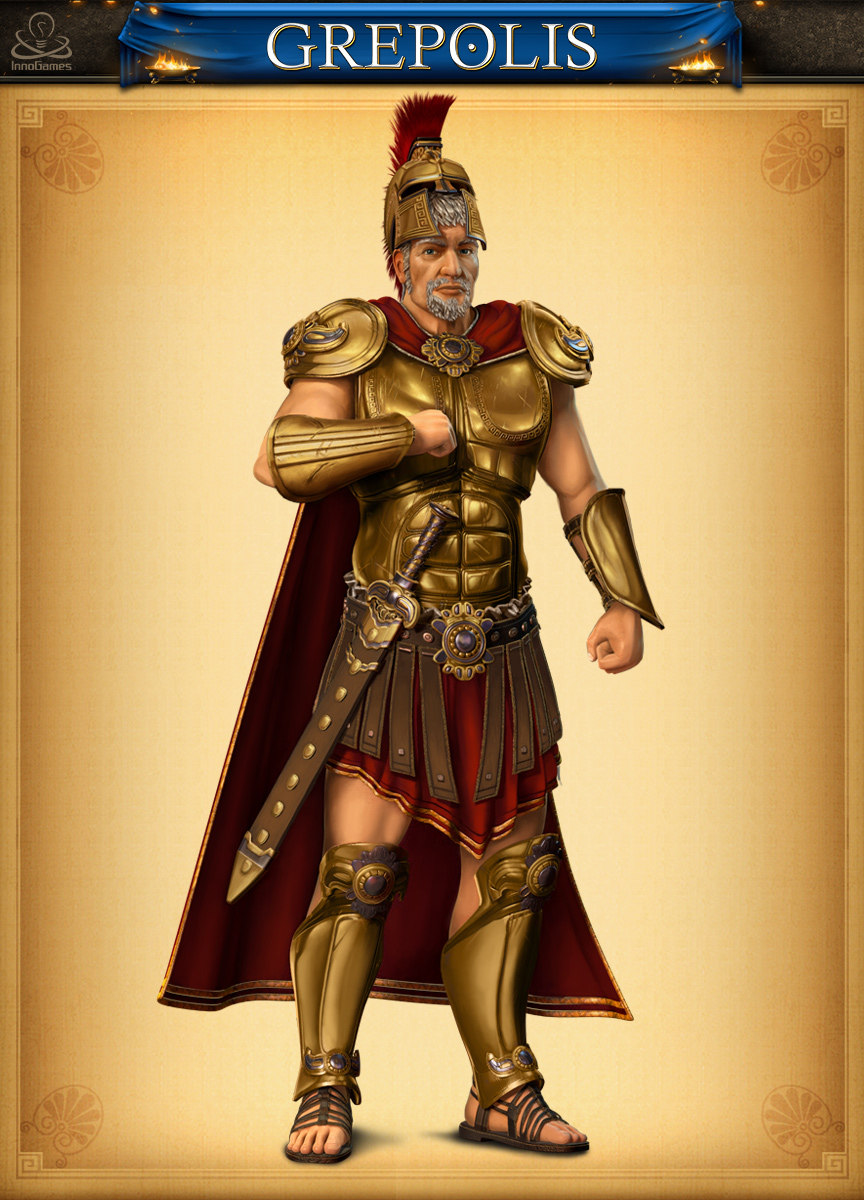
Our final design:
This one is almost done. It just needs a proper background and will then be ready to get integrated in our revamped UI, which has been done in parallel to this illustrative work, both for browser and mobile… But this is another story, that I will tell later. Stay tuned to have another sneak peak on the other advisors, and the updated UI the team is now polishing!


