![]()
In my last post I shared our redesign process regarding the Commander, from the original design you have known for 5 years to the new style we are aiming for. You might now be curious about the 4 other advisors? I guess it is time to reveal more of them and, as I did previously, I will show how they evolved from 3D model iterations to the final, painted character. I will also again share some of our thoughts on the characters throughout the whole process.
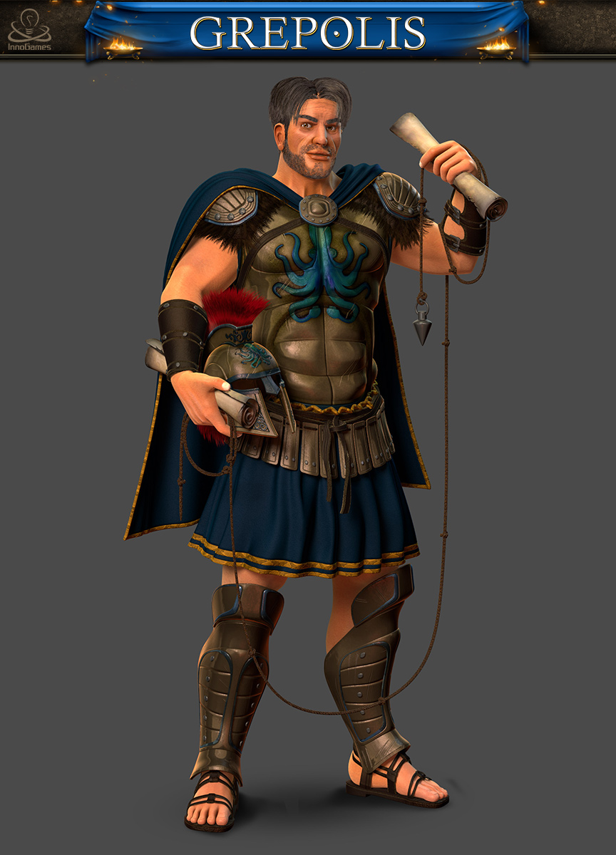
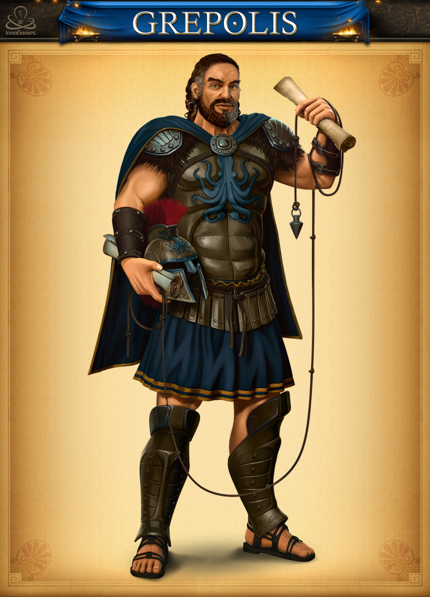
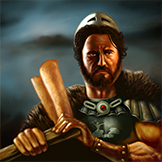 Let’s begin with the Captain. Once again, we aimed for a noble stature and, being a proud and distinguished leader, we determined he should not row the boat himself as he does in the old picture. Instead, we opted to Transition the design towards a more cartographer-like type. In ancient Greece, navigation tools did not really exist, sailors basically used the sky. But how to outfit a character with the sky and starlight? We had to find a viable option, and ended up with the maps and the sounding line. But you don’t simply become a fleet captain without learning the ropes the hard way from the bottom up, and in our new design he remains the same strong man. We only changed the seashell armor for a more regular-shaped one, and added a Kraken emblem.
So, here is the initial 3D model we produced, followed by the painted retakes after feedback within the team:
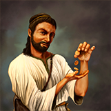
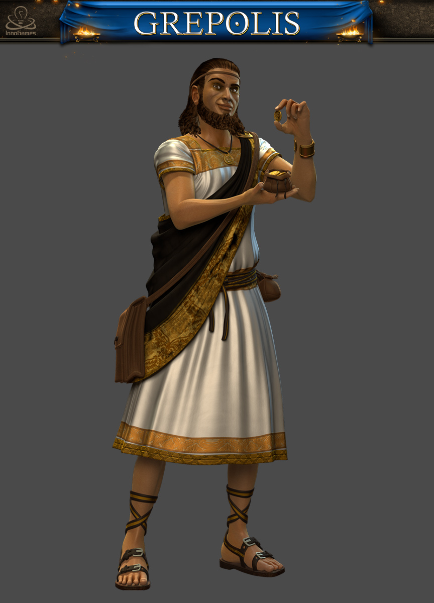
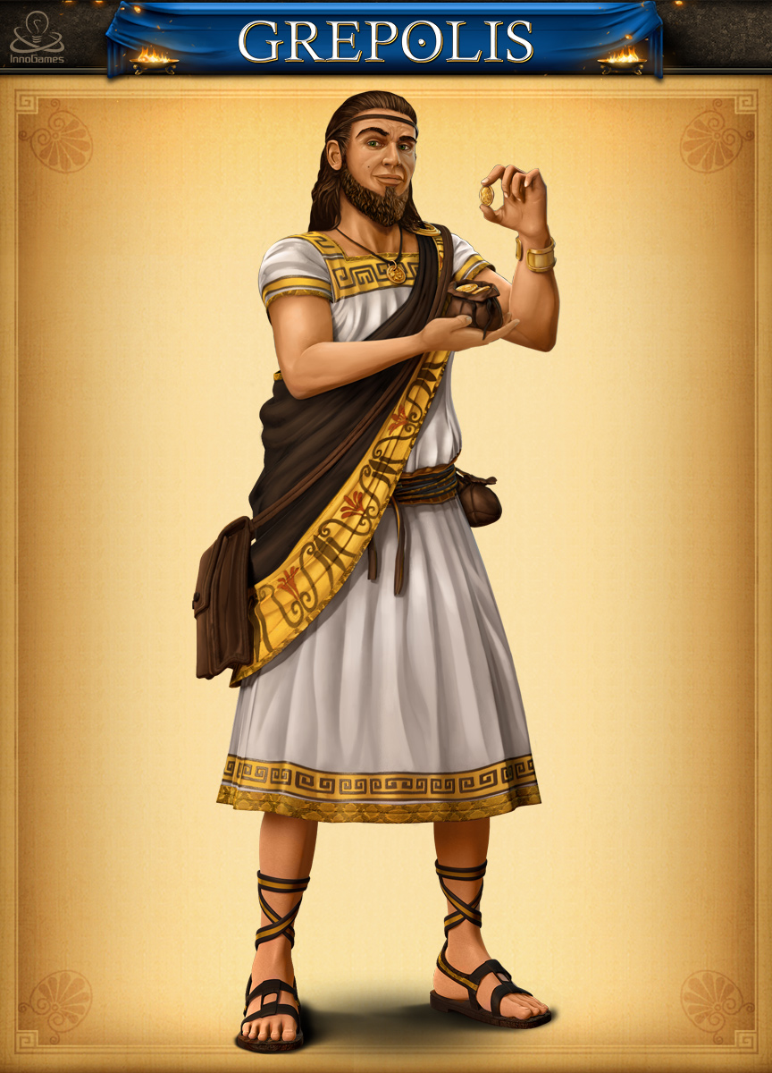
Let’s also take a look at the new Merchant. This redesign has been pretty straightforward, as we basically had nothing to change except the graphic style. The cunning look, playing with gold, everything we needed was already there!
So, here is our brand new character:
That’s it for today! In my next post I’ll introduce the last 2 new advisors you have not seen yet: the Priestess and the Administrator. So stay tuned keep an eye on our blog!

i really love the changes, keep it up!…
i have a question: will you guys change the units graphics? change it please!!! they are very old 😛
We will! Stay tuned 🙂