
![]()
As promised, I am now back for the last episode of the advisors revamp, presenting our new 3D workflow along with the more modern look we are aiming for. This is the last post about them before I disclose more details about their integration into the UI, as we used this opportunity to give the screens a fresh look too!
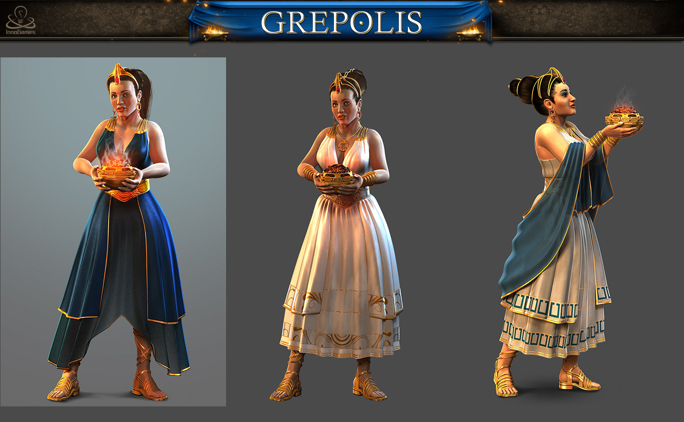
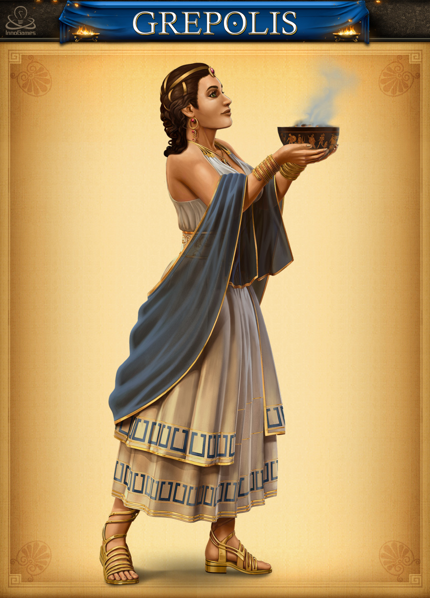
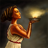 The first design I am going to showcase today is the priestess.
There are not many changes in terms of design in the end; we tried a few other things regarding her dress, but it was somehow turning into a gypsie look. We also decided to keep the profile angle. This profile view creates some kind of a distance between you and this character, which is closer to the divine world. As we tried more face-to-face angles, we found that she could easily be mistaken for a servant, especially because of the iconic bowl of sacred scents in her hands. Our work on the priestess has been a good reminder about the importance of the angle chosen in a particular character design, in addition to the more obvious elements such as the general anatomy, costume, accessories and color scheme.
Let’s take a look at the 3d iterations:
This then is the final, painted version:
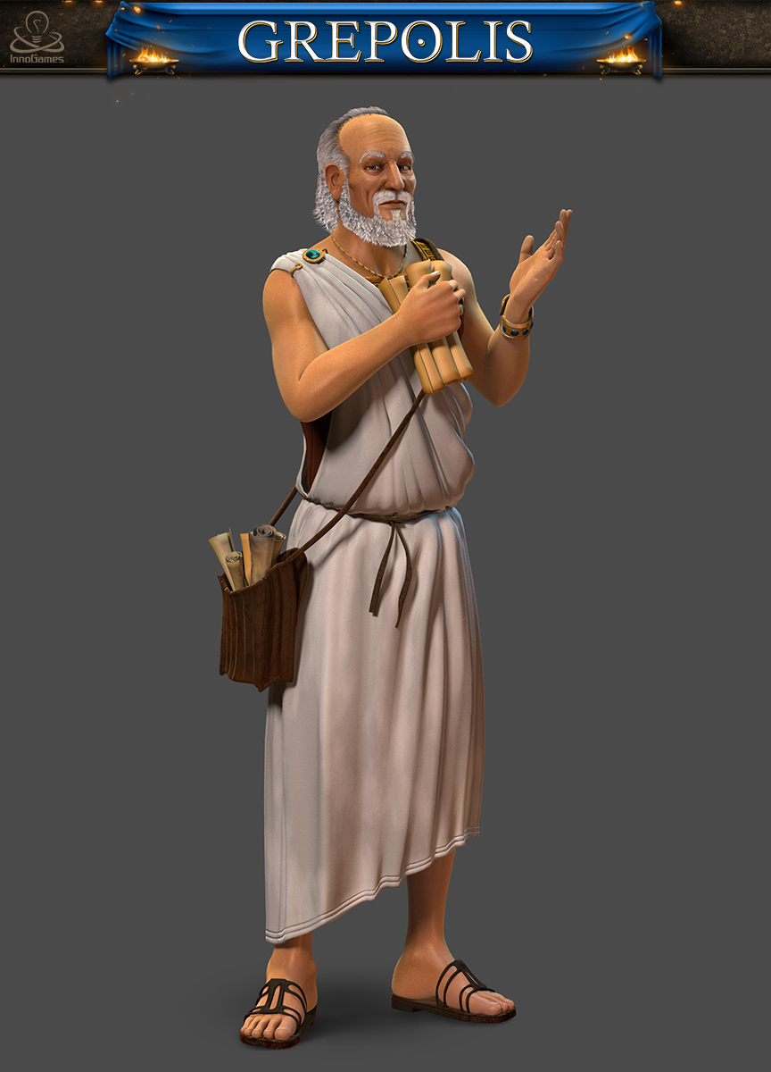
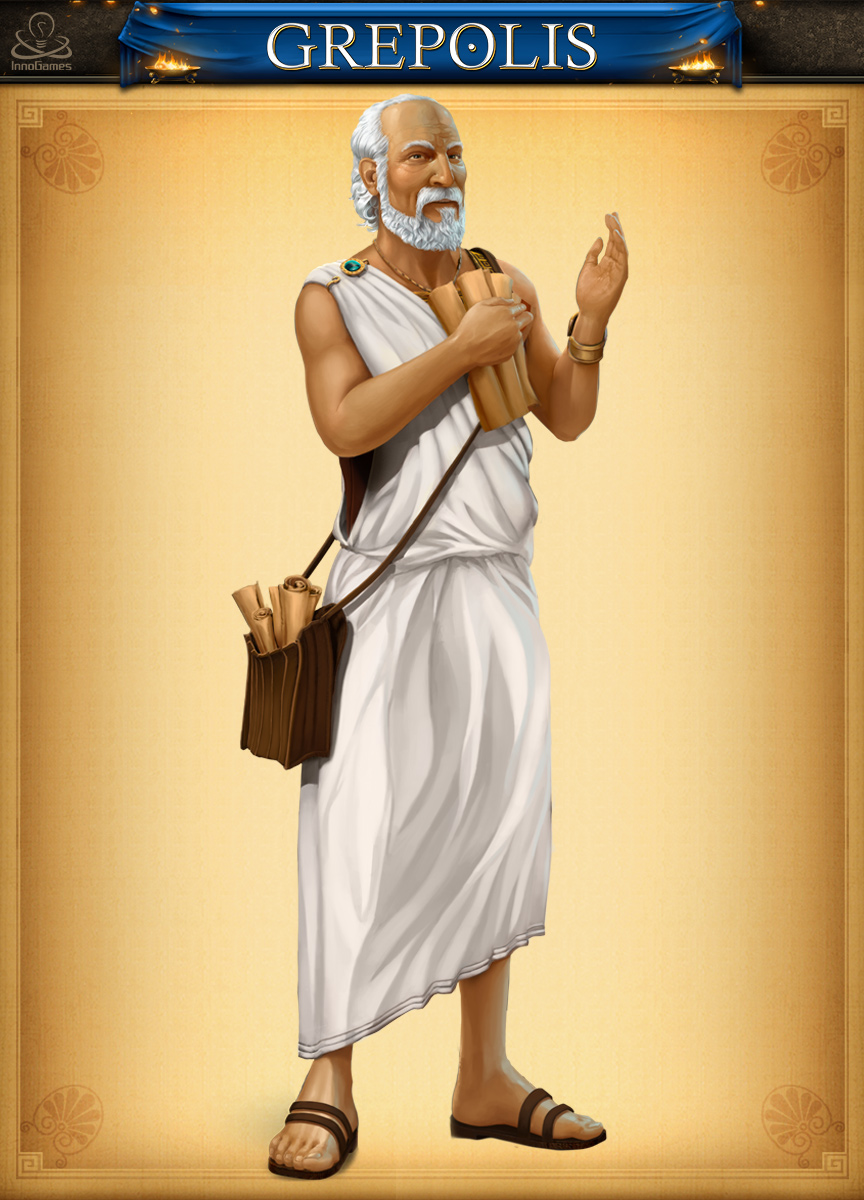
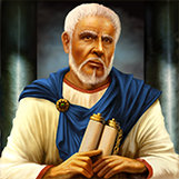 And now I have the pleasure to introduce our last redesign, the Administrator.
For him, there are not many changes in terms of appearance, but we wanted to add a more dynamic pose. In the original illustration, we felt that a lot of attention was given to the fact that he is important and high ranked; the problem was that he is definitely not very inviting or welcoming. You don’t feel like discussing your plans for the city on a regular basis with him. So we chose to focus the redesign on the fact that he is a man of words, used to deal with politics or councils of all kinds, eager to have a conversation. We wanted the player to feel that he promenades around the city all day long. And he also is a field agent!
Bear in mind, these are only the raw designs, out of context. My next post will focus on the UI changes we did for browser and mobile, together with the new graphics. Until then, have a great time in Grepolis!
I think those two are well done!