
Hey everyone!
The forum users among you may know that we have switched to a new forum software and design last year.
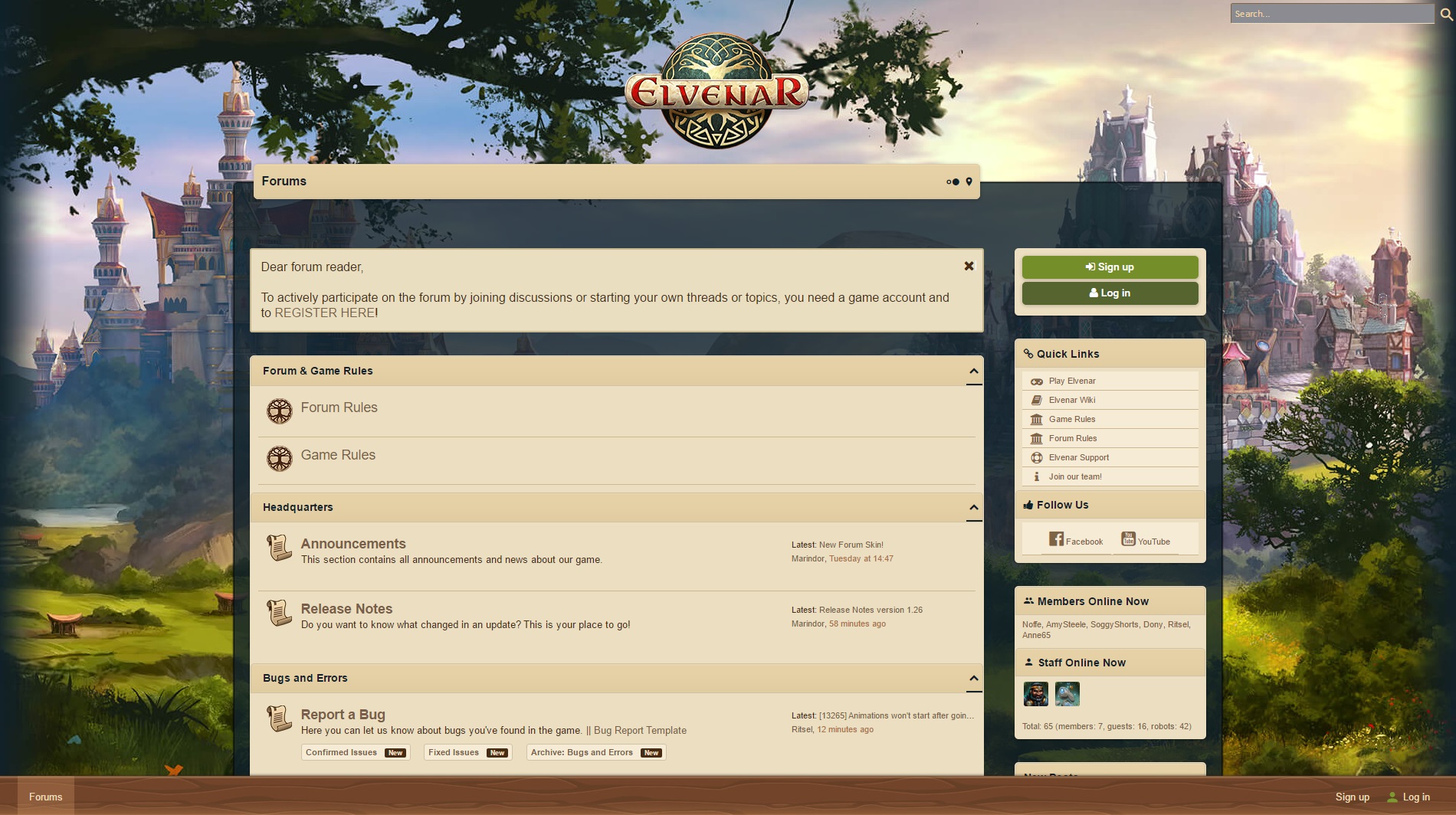
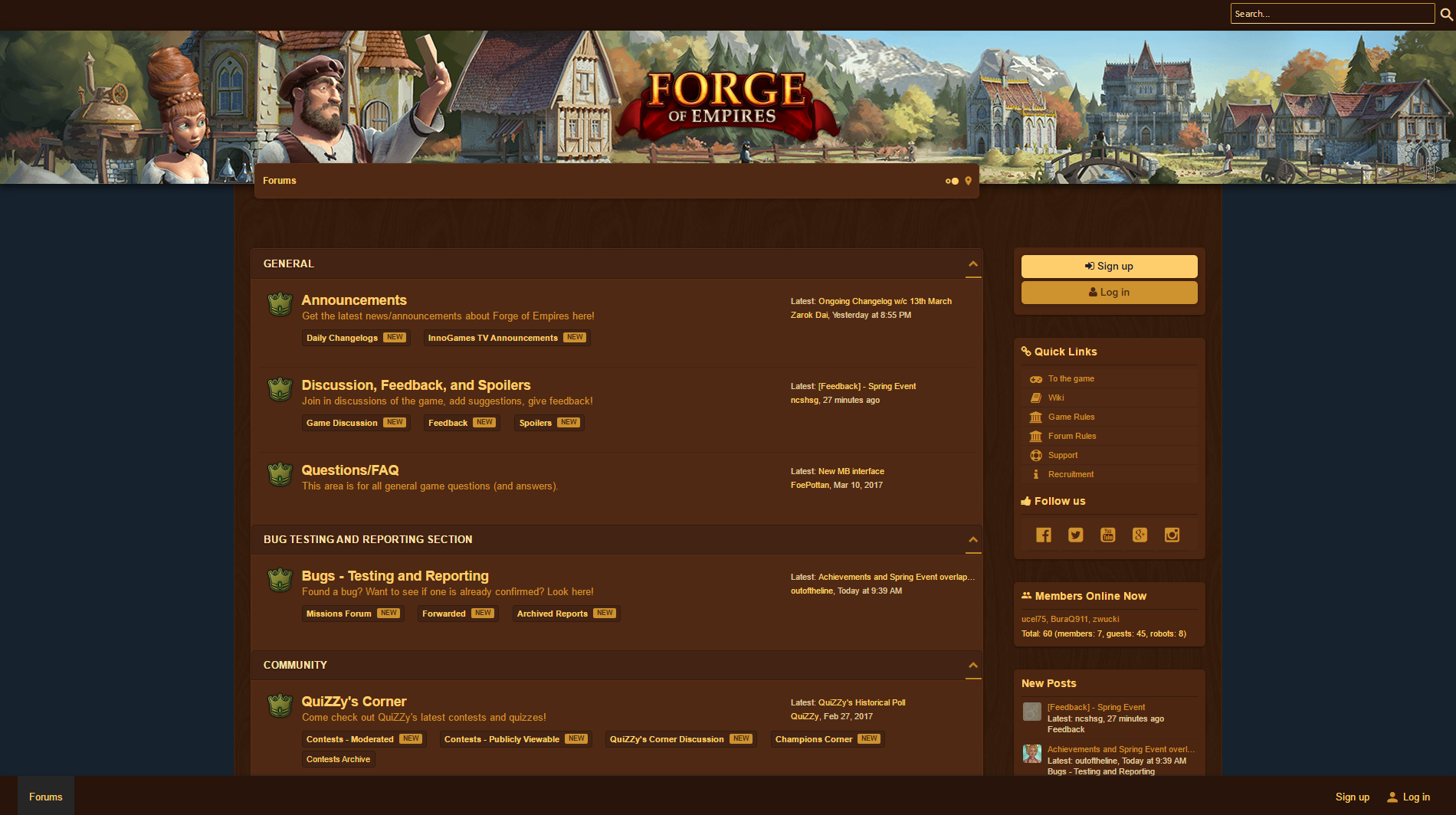
Ever since then we have received valuable feedback about the overall style and usability of the forums. In the meantime other InnoGames projects have migrated their forums to XenForo and updated their designs, with Forge of Empires and Elvenar having received the most recent improvements.
While the aforementioned two projects are testing their new designs on their respective beta forums, we have sat down with our artists recently to look into potential improvements for our very own forum layout.
Our goal will be to make design choices with the following things in mind:
- We will follow Forge’s or Elvenar’s design choices and adapt our style accordingly.
- Quick links will be available for forum registration and log in.
- All graphics need to remain lightweight for mobile use and at the same time scalable for large screen resolutions.
- Feedback showed that the brightness and lack of contrast between forum areas is one of the main concerns with the new design. We would like to improve upon that.
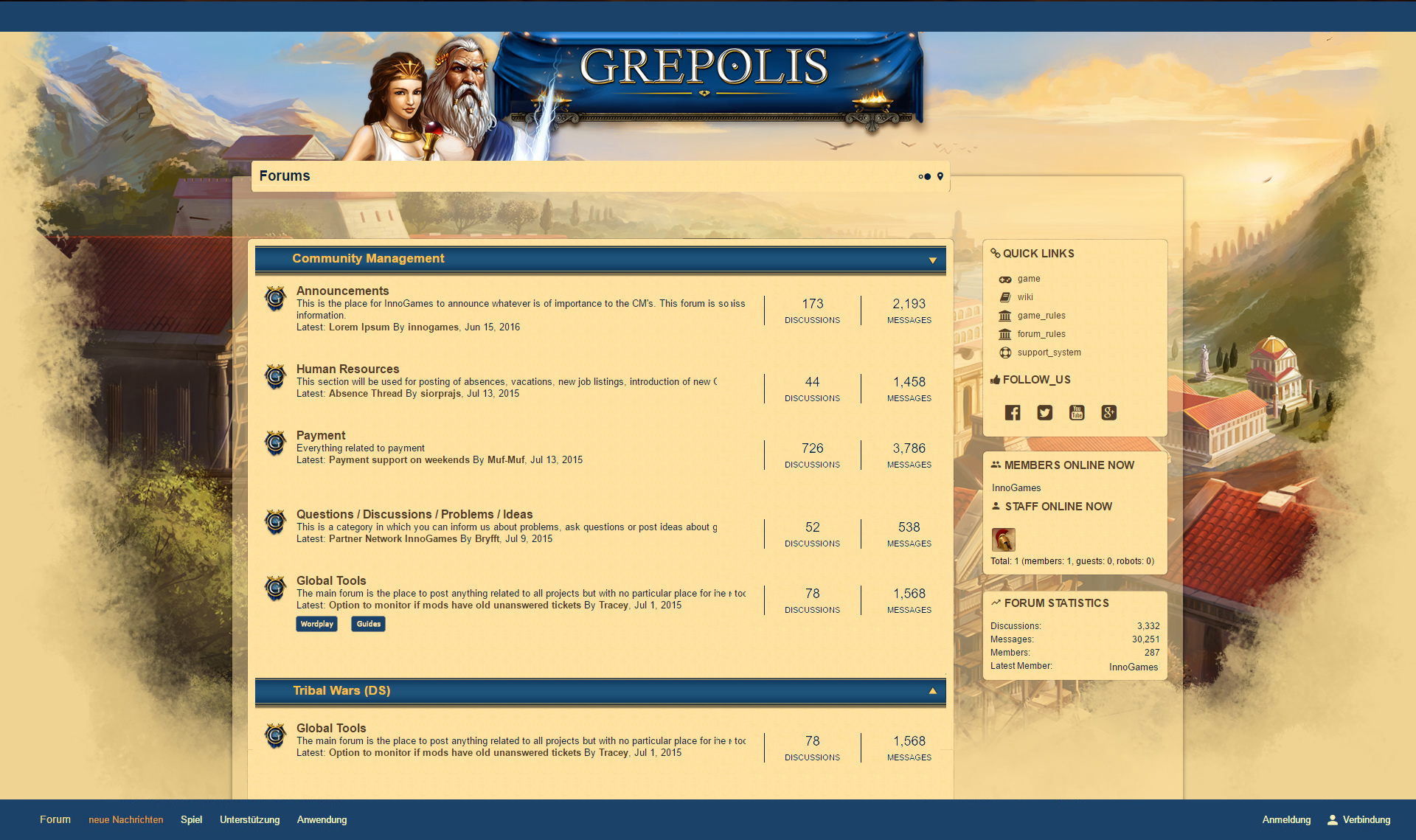
- Subforums were hard to find and will hence return to the forum list instead of being hidden in a dropdown menu.
- The header area showed to be a little too big and will become smaller.
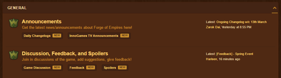
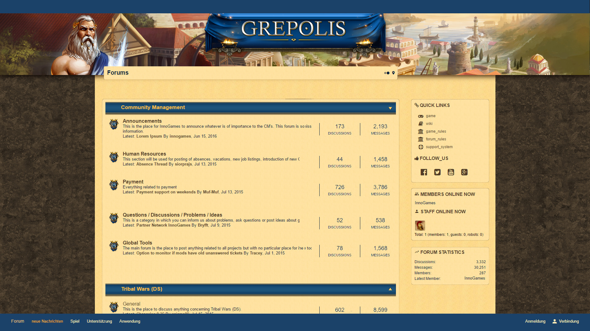
- The discussion and message count for each subforum shown in the forum overview will be replaced with an indicator for the most recent topic and poster as seen below.
Our artist Judith was so kind to provide us with a series of mockups that show the different approaches we could take while reworking our design.
While looking at these graphics, please keep in mind that these are mockups and hence in no way shape or form final designs. Some of the elements outlined above, e.g. the quick links for login and separating lines between forums are not displayed but will become available in the final version.
With that said, let’s take a look at different approaches that we could imagine:
The first mockup is closest to our previous layout. It keeps light colors with a change in background, smaller header design and the new subforum view.
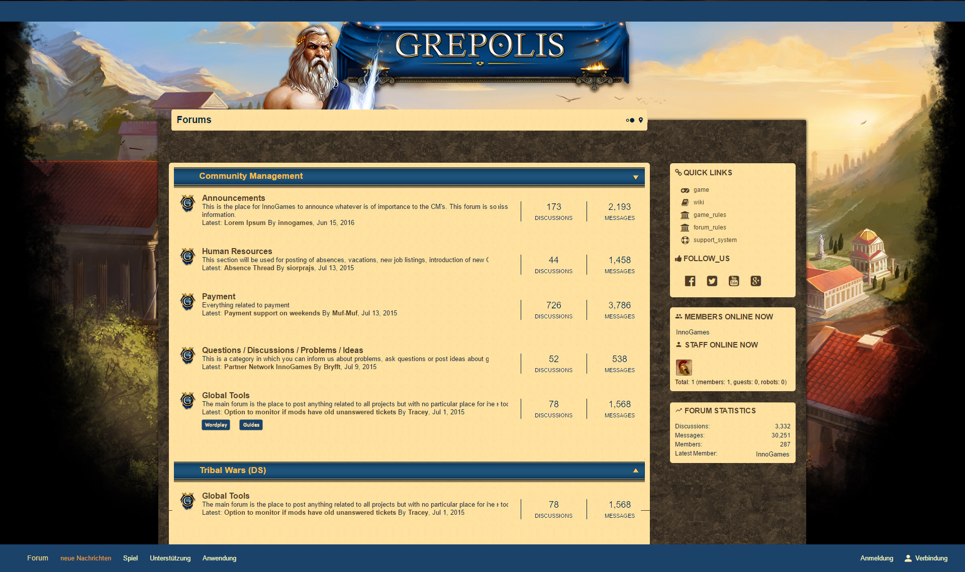
This second version follow’s Forge’s lead by having a clear separation of header and forum background. The dark textures are taken from the game and should remind some of you of past forum designs.
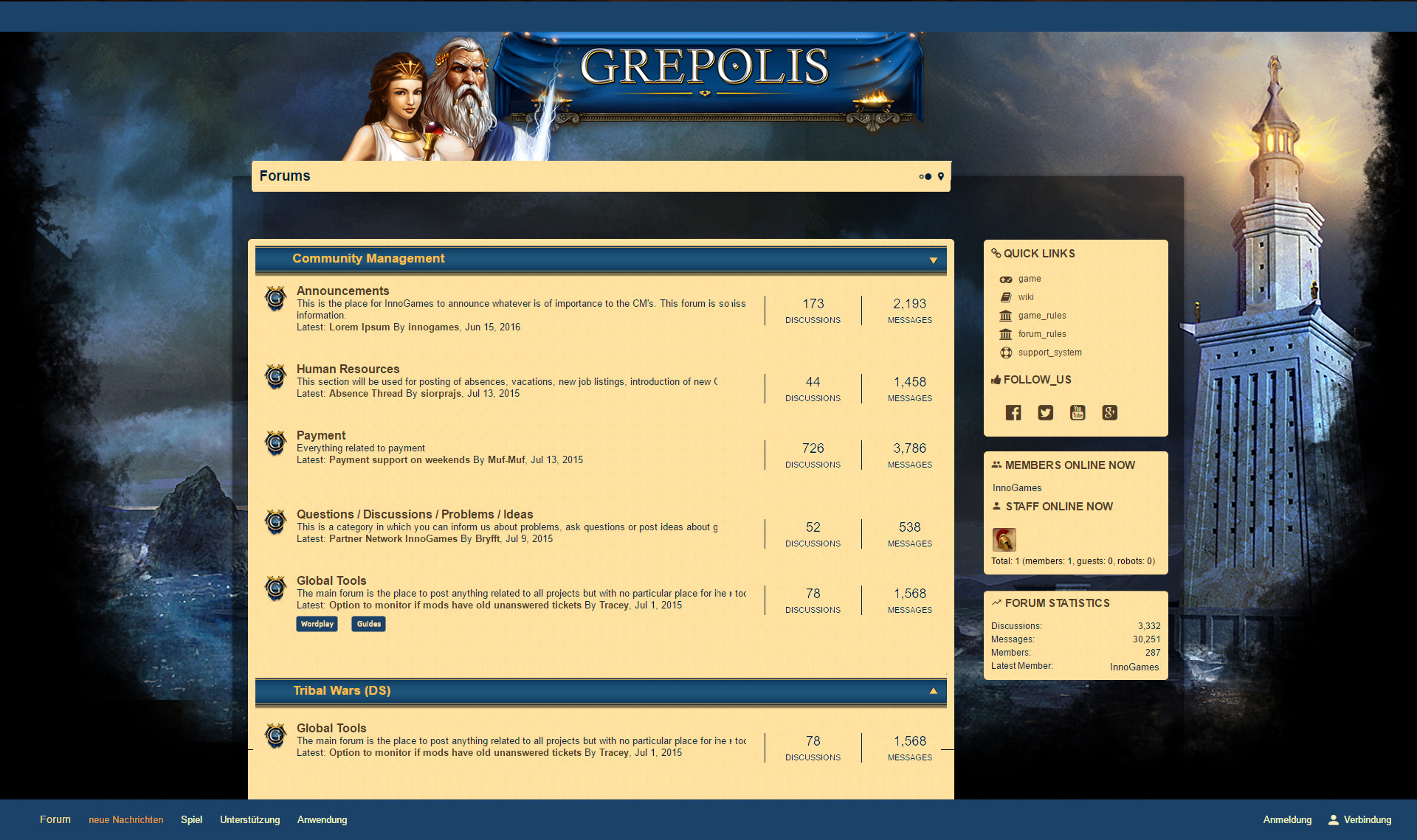
Our third approach mixes both first and second version elements while keeping the background darker than before.
Last but not least a design example that is close to Elvenar’s more modern layout, while sporting a darker background.
Now we would like to ask you for your feedback.
What do you like in each version? Do you prefer darker or lighter forum skins? What are your favorite elements?
Let us know in the comments below or post your feedback on our forums. We’re looking forward to hearing your opinion on each of these ideas!
As Lead Community Manager and passionate gamer, Steffi knows of the importance of transparent information sharing while keeping an eye on the needs of both players & development team. She takes community feedback and makes your voice heard at InnoGames!
Can you give us an example what I can see on mobil or on very small screens?
Sure thing. This is what the mobile view for Elvenar’s and Forge’s forums currently looks like. Ours would be similar. 🙂
Very honest opinion… the 4 screenshots set of you can in the pipe smoking… If you ask me… because the basic problem further down here… and this affects the readability… the only thing changed there is… the background image is darker designed… more has not been changed… but that the main problem here does not change… This concerns the extremely bright background… There,s White posting window… and the black ink… that bites just… I know myself without HD or full HD is nothing more… but we’re talking now not about HD or full HD… We’re now talking about a forum… what you (IG) via the Internet are offered… There also some Web standards should be followed..
http://www.die-barrierefreie-website.de/grundlagen/farbwirkung-und-farbklang.html
https://vsis-www.informatik.uni-hamburg.de/ergonomie/lesbarkeit.html
IG should be read really even exactly this link… tell by the way on the edge..
https://www.drweb.de/magazin/die-16-standardfarben/
regards
Hui Buh
german Player..
How do you feel about the contrasts in-game and on this DevBlog for instance?
We are trying to keep a more or less unified design across the platforms, hence similar font and color choice. In fact, the background color on the forums and on this very site are almost identical – does it cause any issues here?
Of course this is something we can pass on, but in general we would like to keep a fair contrast between a dark font color and a brighter background as that only enhances readability usually – as also stated in your sources.
I imagine the neck hair to resume when I look at the style of the forum. I was a professional web designer myself. I get nightmares when I think of this color scheme here. You offer a forum on the Internet, and do not stick to the standards. You just can not help anymore.
regards
Hui Buh
The third one without black, instead use some golden borders on ‘marble’ body and light brown panels (forum content, quick links etc.)
And have you consider a font change (on some more antic one lets say)?
I also think the pale yellow background for the main text is just a bit to bright and hurts the eyes to look at. From an overall design aspect I like the third dark blue, just because of it’s contrast with the very light yellow.
Something else that could be super helpful but not really a design aspect, that this new forum software doesn’t include is time/date stamping when people quote posts.
The text box coloring is definitely something we can look into.
As for the timestamps being shown along with quotes, this would probably require a third party plugin that we wouldn’t want to rely on. However, if you click the small arrow next to the user name of the quoted player, you will jump to their original comment, where the timestamp is available. Sure, this is not as convenient as the display itself, but when in doubt about the timing, this is a workaround you can use. 🙂