
Hey there!
This is a quick follow-up post in regards to our progress with the new forum layout.
We have gathered a lot of feedback in the past weeks, for the theme itself and the announced features. The overall consensus seems to be that the following two themes are the most pleasing to the eye, with a general preference for the transparent sections in the first version and the background image of the second:
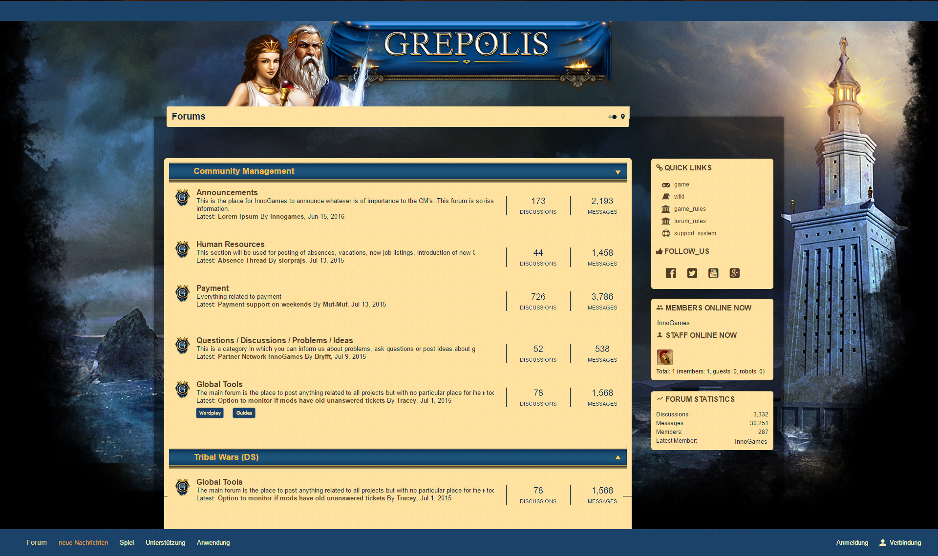
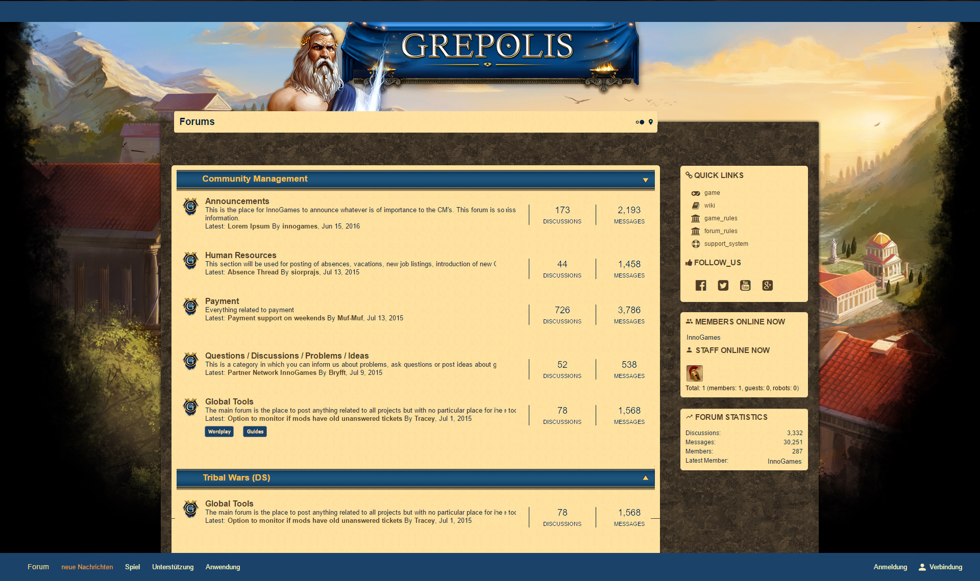
With that feedback in mind we have created two more mockups merging your favorite elements of the two themes above into one. You can preview them here:


Please keep in mind that these are still mock-ups and lacking some of the functionality that will be implemented:
- Registration and Sign-In button above the quick links section
- Dividing lines between forums and subforums
- Most recent post shown instead of # of discussions and replies
We have heard select concerns about the readability of the forums. As our community platforms aim to follow the general style of the game, please expect no drastic change to the dominating colors in these themes – hues of blue and sand will still be the main colors. However, we expect the layout to be more friendly to the eyes nonetheless, given the increased contrast of several key elements.
Furthermore, we are thinking about replacing the current read and unread indicators for more clarity. This is a first idea of how they could look going forward:
![]()
Are you excited to see the new layout in action? Let us know what you think about these two new versions in the comments below!
As Lead Community Manager and passionate gamer, Steffi knows of the importance of transparent information sharing while keeping an eye on the needs of both players & development team. She takes community feedback and makes your voice heard at InnoGames!
It looks so clear… and the first one is even more fresh than the second. So, I vote for the first. However, it’s still too light. If it is little more darker (I’m speaking about slight change, not drastic 😀 maybe something like background color of the sections on the right here on devblog), it’ll be fine. 🙂 The indicators are easy to understand. I like it… I like it even more as I didn’t hope that you will the current layout sometimes. Is finally almost year of waiting and eye-burning gone? 😀
The main problem remains..this concerns the readability..only replaced the background images..Font and background were not changed..Why could also cost money..I only say contrast..You do not want to change anything..Or you’re simply incapable of doing so.. 🙁
regards
Bui Hub
german Player