![]()
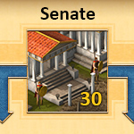
On the long run of the whole app UI refactoring, one next important step is to rework the senate screen. The senate is a key screen in Grepolis, and beyond the “cosmetic” adaptation to the new bright paper style, we felt like adding some improvements in terms of usability. Its purpose is not only to construct, destroy or upgrade buildings, but also to provide a clear overview of what is going in on. Managing several cities can get complicated and we want players to access all information as easily as possible. Today I will share with you our process within the creative team (game designers and artists) to tackle this redesign of the screen.
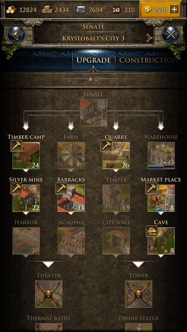
Let’s take a first step at improving the design, by looking at the current screen and identifying some of its flaws:
Construction Tab
Since we already implemented the construction queue as a scroll overlay disconnected from the senate, and directly reachable from the city overview by tapping the left bar hammer icon, the tab is now irrelevant.
The Building Cannot Be Upgraded
There is no clear distinction between a building that has already been constructed and a building still missing in the city. Their main characteristic when you cannot upgrade: they are displayed at a 30% opacity level to make it clear you cannot click them. Problem is, the name and level are also low on opacity, so very hard to read. On this example, can you tell the difference between a building at max level (yellow font) and a building at level 0 (regular white font)? Also, a building at level 0 is not very graceful and encouraging, especially when you take care of a brand new city full of 0’s.
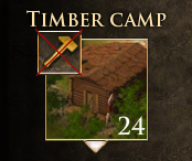
The Building Ready For Upgrade
In contrast, a building ready for upgrade or construction is fully visible, that way they immediately pop in the senate. This would have been enough, but we have here one more element, the hammer, that emphasizes the upgrade/build feature. Since it was designed in same golden/brown textures as the background, it directly contradicts the bold colors of the icons and add weights and confusion to the design. Mobile screens are small, so each element can weigh a lot, and we should not use space to give twice the same information.
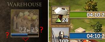
The Building Is Currently Upgraded
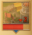
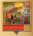
First thing in that case: the progress bar is blue, while the regular color for upgrades is green (blue is for troops recruitment and movements) as you can see in this crop of a city overview screen! An inconsistency that we must correct.
Another point: the level building is displayed in white, so are the next level it’s being upgraded to and the upgrade arrow. If they were green, you could relate immediately to the progress bar and the upgrading process. I addition to that, it’s already displayed in green in the browser version, we need consistency once more.
Regarding the upgrade arrow: while we have it pointing upwards in the city overview, here we have it pointing from left to right. As a consequence, to make it clear it is an upgrade and not a destruction that has been sequenced, we have the obligation to add the previous level. We need to simplify and get the design fitting to how we display things in the town overview.
One last thing, as UI design is all about details: noticed that the white framed arrow underneath the building icon suddenly disappeared?
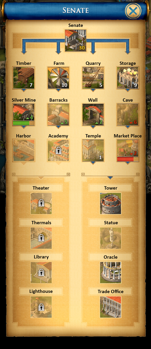
From this first analysis, we built the new design and carefully detailed all cases possible in the senate, producing clear mockups for each one. We need to cover everything and ensure that the design is consistent with the city overview and the browser version of Grepolis. Here is the mockup we developed and delivered to the developers, with design details for all possible cases :
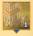
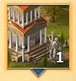
New Frames
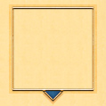
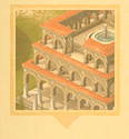
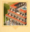
We now display 2 distinct frames for the building icons. On the left, buildings that are still not constructed have a discreet border with an arrow pointing down. On the right, we add a metallic frame that embeds a blue arrow: on last updates you must have noticed the bright blue new buttons, the idea is to use this blue as key color for strong actions and active areas. Therefore, this frame is our way to point out the erected buildings that enable new constructions, following the tech tree.
New Buildings
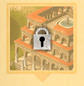
For new buildings to erect, first thing we did was to stop displaying its disgraceful level 0. The lock on the right is a new element, for buildings that are still out of reach because of its requirements.
Erected Buildings
We removed all the useless graphical elements and made the building level clearly readable on all states. We focus on the opacity as unique mean to show whether it can be upgraded or not.
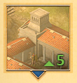
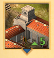
Upgrade
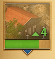
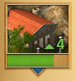
We now focus on the green as key color and simplified the display with the arrow pointing up to the next level. If you have several updates of the same building in the queue, we will display the higher level you are aiming at.
Downgrade
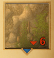
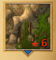
Same as the upgrade, just more… red.
Level Max
And finally, the buildings at max level will keep the same status as before, meaning the level displayed in yellow. We wandered at some point if we should add some WOW! effect, but since we want to keep the senate as easy to read as possible, we thought some more graphical “noise” would probably confront the synthesis role of the screen.
As you can see, this new UI we introduced some months ago is not just about the looks of the game. The core of the new style is to make the whole app fresher and easier to apprehend; in its trail we put a lot of effort in polishing the first version flaws in terms of usability and readability. We are already investing our energy in the next screens and features to make the mobile Grepolis experience better, so stay tuned! We will soon share our progress on some pretty fancy screens, why not… the Advisors?




There so manny problems with the app. Looks should be the least of your concerns.
Make it so you can see reports, send reports. Simulator, Bbcode, change the time on the app, there so many bugs. It’s insane. I could continue with things that need to be done.
If you make the app a standalone this game will skyrocket. Right now the app is only useful for alarms. And occasionally reading messages from other players.
So stop trying to change the looks of there game and actually make it a useful app.
Thanks for your feedback, Dmac. We are aware of these problems and try to fix them as soon as we can.
It will be fine, to have a detailed description in the wiki.
The page about the app will also be revamped soon, but at the moment it doesn’t make that much sens as we are still doing many changes to the app.
Today there was the update of the app 2.78 within the senat revamp.
First of all, I want to say: Thank you! It looks like fantastical and I like it.
Unfortunately the handling of it is not very workable. After you confirmed the construction you jumped always back to the city overview. Due to my feeling that’s insufficient. I prefer to go after upgrading back to the senat building overview. My second problem is, that I can not change the cities during the time the senat overview is open. It’s very time consuming to leave the overview and changing the city and after this to go back to overview. I would prefer to change the city, during the window is open.
Hey Mim,
Thanks for your positive feedback.
I totally agree to your suggestions. Both issues are not intended but we currently have to live with it because of technical restrictions. There are still multiple overlays where the UI in the background is darkened and a city switch is not possible. We want to change this within the next sprints.
Same for the upgrade behavior. We will change this asap, so the senate stays open in the background and if you click “upgrade”, only the construction screen of the corresponding building closes and you will be back in the senate afterwards.
I just went over to the app guys and pushed both issues.