Wow, it’s already been two months since my last article here … time to show you some more stuff we are currently working on.
First, about showing different city states more graphically on the map, namely:
- cities during noob protection
- other cities you recently (in the last 12h?) attacked – so you know which cities you already farmed and don’t have to check the reports over and over
- your own cities that got attacked recently
- own cities in revolt / under siege (2 states for revolt, 1 state for siege)
No worries, these won’t be animated to not cause performance issues. It’s just a small visual hint to save you some clicks.
The second thing we also thought about are the tooltips on the island map:
Right now, if you hover a city on the map, you don’t get that much information, only:
- city name
- player name
- city points
- alliance name
- city reservations
Even with your own cities, you don’t see anything else, you always have to select a city to be able to see more details. So we were brainstorming what kind of information should be visible there? Our ideas so far include:
- Beginners protection (with end time) – you currently only see that as a tooltip on the attack button, it would be way more convenient to see that directly on all cities
- The name of the city group the city is in (if you have the advisor enabled)
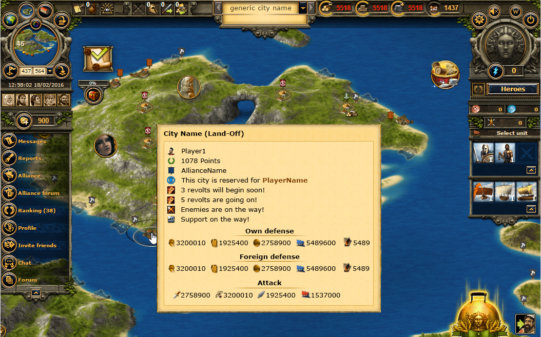
- If the city is currently in revolt / being conquered (maybe with end times)
- Attacks on their way
- Incoming support
- Own troops (maybe even supporting troops, combined or seperately listed) in the city summed up as defense values, so you can see in a glance if you are e.g. lacking defense vs ranged or sharp
- Number of fireships in that city (extra, because they don’t have a sea defense value)
As an example we have prepared a “worst-case-scenario” with a lot of information we could imagine being useful there. Of course only for your own cities!

What are your thoughts? What should we show, what would be a nice addition and what is a no-go? And if we show the fight values, would you rather like to see the sum of all base values (this would be enough to quickly figure out in which defense type you are good/bad) or the exactly calculated value with all the modifiers like research, tower, heroes, spells, …?


This looks great, but the window that opens when hovering the mouse over a city is too big. It would be good to choose which information we want to show and which we don’t. A bit like the choice we have for each notification, with boxes to check/uncheck 🙂
To add that to the settings is a nice idea, thanks for your feedback
May I ask a first short question for the foreign support?
Actually I or the grepolis player have no Idea, what the foreign player have sent to your city. Sometimes, their give you information in the forum, but they have not to do so.
If you see, what support on the road and you play a conquer world, it’s very nice to know, what will arrived after Colony Ship. So you can attack your own city with the correct kind of units.
How do you will manage this missmatch?
…to be continued
Hey Mim le Fay,
we would only show the foreign support that already arrived and currently is in the city (basically summed up values of what you see in the agora or conquest info window). Generally we do not plan on showing more information that is currently not yet available to players. Only to make those information better visible that is kind of hidden right now.
I prefer to show amount of units not sum of their fight values. Imho it is useless. I don’t need to know these numbers exactly, just estimate it in case that I want to find weaknesses in defense. 90% of attacks are randomly recruited, it is not calculated. So, do I need this? As said, add options to the settings.
Thanks for your feedback Thasoss.
We went for the fight values (in this approach), so it is easier to spot weaknesses. In this case you have a maximum of 5 values to compare (blunt, sharp, distance, sea, fireships) instead of 14 units to look at (including the mythical, but leaving out the non-fighting like transport ships and colo).
I think this would be a good idea, but will it be possible to have a smaller box with these informations ? And will it be possible to disable these animations ?
Thanks for your comment Orlaya, as I said in the article, there will be no animations, only static image overlays. Would you want to disable them too? Unfortunately, if we want to display all that information, the box needs to be this big to be still readable. But as some players already asked, we are thinking of enabling you to customize the content of the tooltip, so you could directly affect the size (but have less information when doing so).
Awesome changes. The more information, the better.
what i would like to see, is when you mouseover ally cities for it to show on the popup if you have support there
would be much easier when checking trips and what you have in them instead of having to click every city to see if you have support there
I like that. We will keep that in mind, when we finalize the concept for this new tooltip. Thanks for your feedback.
Hi Tobias,
The images for cities with noob protection, are they also implemented in the app?
Hi DonFrank, Yes the shield graphic will also be displayed on the app. The new version was just released to the app stores a few hours ago. Hope you like it.