![]()
We would like to thank you for your feedback regarding the recent changes of the farming villages and today we would like to show you what our designers came up with according to your feedback.
At first we would like to explain how this change was designed.
As you might know we have some inconsistency in Grepolis and with the recent market place changes our plan was to correct some of them. We thought about which order would be easier to read for our players:
- a) You get – You pay
- b) You pay – You get
In the first step we orientated ourselves at the current design of the market place (You get – You pay). Here we used the typical example of online shops, receipts and invoices: You can clearly see that the item (You get) is listed first and at the end you can find the price (You pay).
In the second step the feature unfortunately wasn’t completely released so that some smaller improvements were still missing. We would like to apologize for this and will work on a better workflow so that such things won’t happen again in the future.
After we received your feedback we had a meeting and thought about which use cases would be possible for the different screens. The resulting ideas are the following:
- As a player I have a lack of a certain resource so I’m in need of it. It’s important for me to know WHERE I can get this resource and after that HOW I can get this resource. As a consequence the reading direction is: You get – You pay.
- As a player I have too much of a certain resource and want to trade it for another resource of which I have too less. As a consequence the reading direction is: You pay – You get.
- Following these considerations it may happen that some players have the feeling of an inconsistency as the reading direction may differ at two different features. But why? Because the use case can be different, even if in both features it’s all about the trade of resources.
- Furthermore we also have to think about how long features will actually be available in the game and what impact it may have on our longtime players but also on new players and to gather learnings regarding to this. Of course we try to balance and only release changes which are considered satisfying.
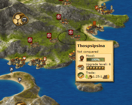
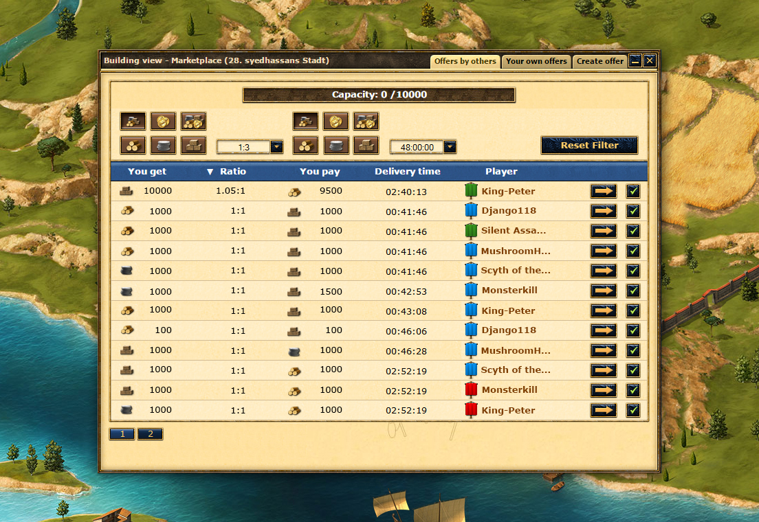
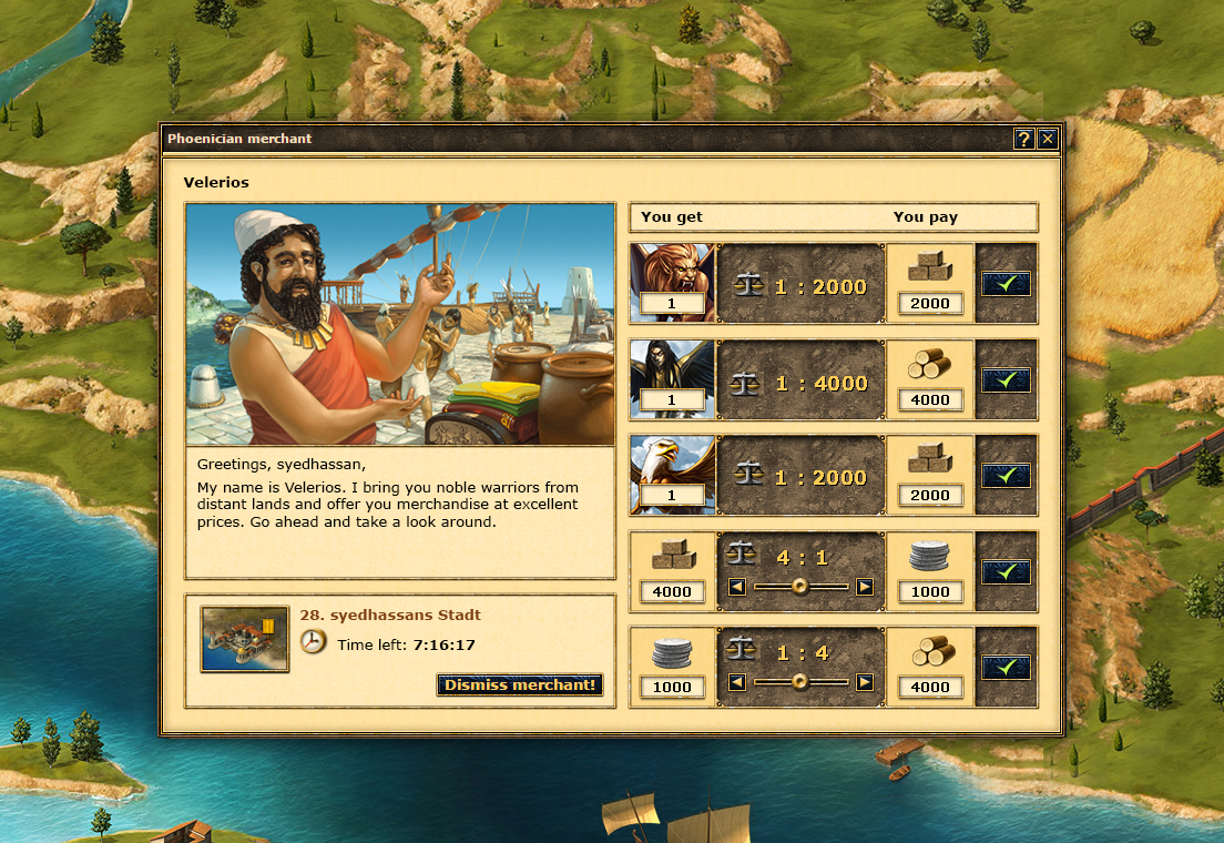
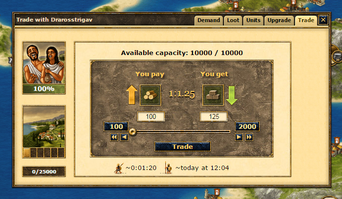
Attached you can find different options for different areas of trading that we reworked for all the different screens.
We would really like to hear your feedback about the two different consistent ordering options (both including the improvements based on your feedback) and if we forgot anything.
Option a (You get – you pay)
Option b (You pay – you get)




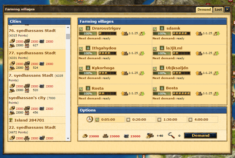
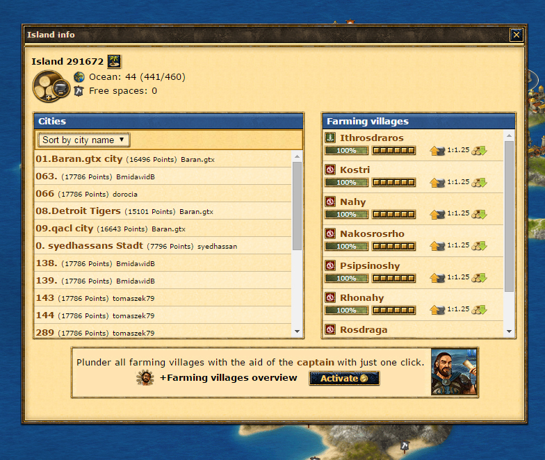

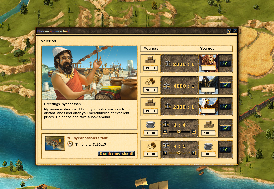
I think the difference is none, as long as the delivering time is shorter than 3-5 minutes.
My wote is for you pay you get
And the same for tablet or PC
It was better before change – So I prefere Option B
Option A, is totaly crasy also the way it count how manny resources you send
Let us get the old back
Option b is the way to go in my opinion.
It seems more logical and is closer to real life because we get things only after we pay for them. Just like buying in game gold:
you pay – you get.
And not the other way around
If you really like feedback, maybe you should consider the moderation policy of this devblog. Instead of removing inappropriate comments, you have a policy where comments need to be approved.
Whats worse? Most negative feedback is never approved even if they contain nothing objectionable (especially in last 6 weeks), and only the positive comments actually become visible.
As for this market place, I would say option B.
Also i would to say that i don’t like the next update you trading system, where res capacity left works the other way out. Earlier you were showed how many res are being sent, now you show how many can be sent. Also new system is not fully smooth.
Hi Hasan, thanks for you feedback. We decided to approve comments first, after we got too much spam (the nasty stuff).
I prefer the option B: You pay – You get
After four years, reversing trades only creates confusion for the players. Normally, a person (in life) doesn’t receive to give, but give to receive.
Option B please.
the Dutch Community Manager will translate my arguments posted on the Dutch fora.
I prefer option B.
The difference is insignificant…
Let’s discuss about important thing such as Endgame?
Only option B, because as I said on Beta forum: nobody has any problem with this for 5 years? So why change?)
I like option A: get-pay for Phoenician Merchant & option B: pay–get for everything else
Just a wild thought-Make this a user-selectable setting. Players could choose for themselves which way they want it to display for them. Each player could have it his way.
As for me, I liked the old way better.
I vote for option a
But there are a few other suggestions, in this matter.
Price calculation
=================
First of all, it would helpful if future would use a standard always and the same Price calculation. To achieve a good visibility and clarity of prices, the only way is the specification for no more than two decimal numbers and to calculate as follows: The Total of the sales to goods have to be divided by the total of purchased goods or units. After your change it with last update, there are a small confusion, because suddenly there changed one calculation method into two. I guess this has to be avoided.
Available trade capacity
========================
Actually, the change in the presentation of available trade capacity was more than surprising. This has deteriorated significantly as a result. It would be good to return to the old view. You will find an enclosed graphic that shows how the individual graphs now run against each other, that’s not my understanding of unification. Alternatively, you can use a draft of a graphic that is similar to the overview for supplying own cities.
[url=http://www.fotos-hochladen.net][img]http://img5.fotos-hochladen.net/uploads/20150607liefer1dcxbnsw95.png[/img][/url]
Option B
And also correct the counter of SENT resources.
Pay – Get every time.
Who on earth thought it would be a good idea to change something for the sake of it, and not for the better either?